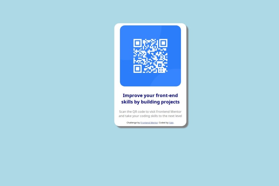
Design comparison
Solution retrospective
I am most proud of the information I remembered of my previous CSS learning.
What challenges did you encounter, and how did you overcome them?I found the issue of setting up the file structure correctly so when I pushed to git and published git pages everything connected.
It took a bit to go back to copy the file path once it was all in the git repository to get things connected.
Additionally I always find centering the object vertically a concept I forget. I had to refresh my memory of the method with W3Schools about centering objects.
What specific areas of your project would you like help with?Any feedback especially on the mobile aspect of it.
Community feedback
- @mbank14Posted 3 months ago
Hello, on mobile view you can remove the padding on the <body> tag, and for the QR image, in the .qrimage class, you can set the width to 100%.
And perhaps this is a minor tip: you can edit the border-radius on the .container class to 24px and the border-radius on the .qrimage class to 16px. Sometimes multiples of 8 work wonders in design.
Marked as helpful0
Please log in to post a comment
Log in with GitHubJoin our Discord community
Join thousands of Frontend Mentor community members taking the challenges, sharing resources, helping each other, and chatting about all things front-end!
Join our Discord
