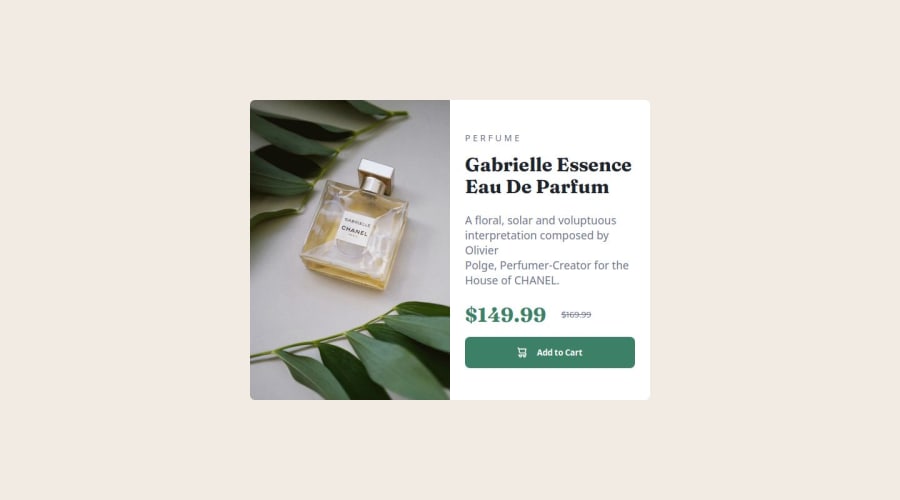
Responsive Mobile-first Product Preview Card Component


Design comparison

Solution retrospective
I'm proud that I built the project using a mobile-first approach for the first time, then scaled it up to tablets and desktops with media queries.
Next time, I might use Sass to better organize the CSS, which I think would be really helpful for larger and more complex projects.
What challenges did you encounter, and how did you overcome them?I struggled to make the space occupied by the image and textual content a 1:1 ratio using flexbox. I tried the flex: 1; property in each class but couldn’t get the desired result. Eventually, I switched to a grid layout and achieved the 1:1 ratio using grid-template-columns: 1fr 1fr;
I’d like to understand what I might have missed with the flexbox approach to achieve equal width for the image and text. I think there’s a bit of a conceptual gap in my understanding.
Community feedback
Please log in to post a comment
Log in with GitHub
Join our Discord community
Join thousands of Frontend Mentor community members taking the challenges, sharing resources, helping each other, and chatting about all things front-end!
Join our Discord