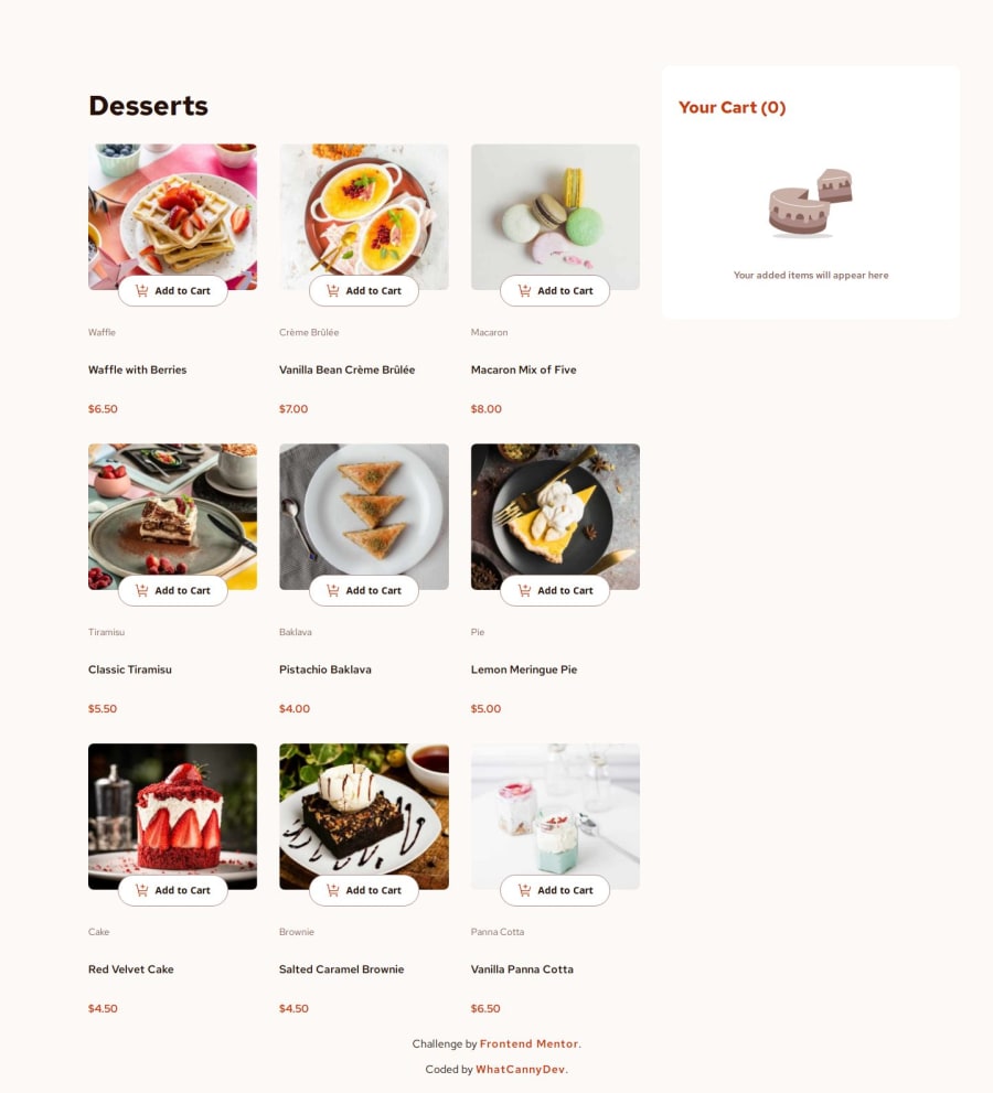
Responsive Mobile-first product list with cart (Angular 18)
Design comparison
Solution retrospective
I'm proud to have finished this challenge (and also to have deployed it... I fought for it! and I did it). If I had to do things differently, I wouldn't change a thing... because the main challenge for me was to do this project with Angular 18 to familiarize myself with it, relearn the basics, see the Signals and their power.
What challenges did you encounter, and how did you overcome them?Each step was a difficulty in itself... or rather a learning experience. Thanks to the documentation... especially the documentation and a little help from ChatGPT to explain what I didn't understand, and don't worry, ChatGPT didn't do this challenge for me because he doesn't know Angular 18, or 17 for that matter... a version from which the framework has changed enormously, the documentation is on a different site, that's saying something...
What specific areas of your project would you like help with?Nothing in particular, but always open to comments and criticism that will help me improve.
Community feedback
- @AdrianoEscarabotePosted about 1 month ago
HI, Ronan, hope you're doing well! I loved how your project turned out, but I’ve got a few suggestions that could be useful:
I noticed that your
order confirmed
modal is not centered, a tip I can give you so you can keep it centered and fixed on the screen:remove the paddings:
@media (min-width: 1440px) { .modal--background[_ngcontent-ng-c109615066] { /* padding: 88px 40px; */ } } @media (min-width: 768px) { .modal--background[_ngcontent-ng-c109615066] { /* padding: 40px; */ } }
and change
position
tofixed
:.modal--background[_ngcontent-ng-c109615066] { display: none; position: fixed; inset: 0; justify-content: center; align-items: center; width: 100%; height: 100%; background-color: #00000080; z-index: 1000; }
By doing this you will have a fixed and centralized modal on any device.
The rest is fantastic.
Hopefully, you'll find it helpful. 👍
Marked as helpful1 - @Andigashi1Posted about 1 month ago
Hi there and great job finishing this project!! I wanted to leave a comment to let you know that the layout in mobile view is not properly centered.
1@CannyRoPosted about 1 month ago@Andigashi1 Thanks a lot. I thought it was working well because everything seems OK when I use the device toolbar in Chrome, but I've just visited the page directly from my mobile and the rendering isn't what I expected. Thanks, I'll have to tweak that.
0
Please log in to post a comment
Log in with GitHubJoin our Discord community
Join thousands of Frontend Mentor community members taking the challenges, sharing resources, helping each other, and chatting about all things front-end!
Join our Discord