Responsive Mobile-First mortgage-repayment-calculator-main
Design comparison
Solution retrospective
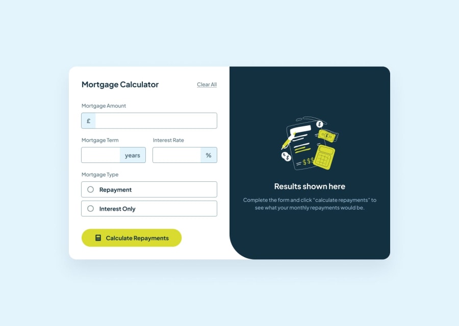
So this was fun. The thing that gave me the most trouble was the lime colored outline on the radio buttons when they are checked. First I tried changing the accent-color to hex #d7da2f which is the equivalent of the lime hsl color in the style guide but that only changed the inside and not the border. Interestingly, when I changed the accent-color to red it DID change both the border and the inside circle to red. But after some playing around with it and some googling, I went with 2 pseudo-elements: (when .checked) one :after the input for the inside circle and another :before the words repayment and interest-only for the outside circle.
I googled to get the function for the monthly repayments calculation and then used what little "logic" I actually have to get the other calculations.
To get the commas for the large numbers I tried my heart out with .toLocaleString() but the whole - is it a number or is it a string thing nearly did my head it. I had more console.logs than I have ever had before and typeof's to try to figure out what was going on. In the end, I recalled Wes Bos and his JS30 project - Type Ahead - and I "borrowed" his function for numberWithCommas which did the trick.
Community feedback
Please log in to post a comment
Log in with GitHubJoin our Discord community
Join thousands of Frontend Mentor community members taking the challenges, sharing resources, helping each other, and chatting about all things front-end!
Join our Discord
