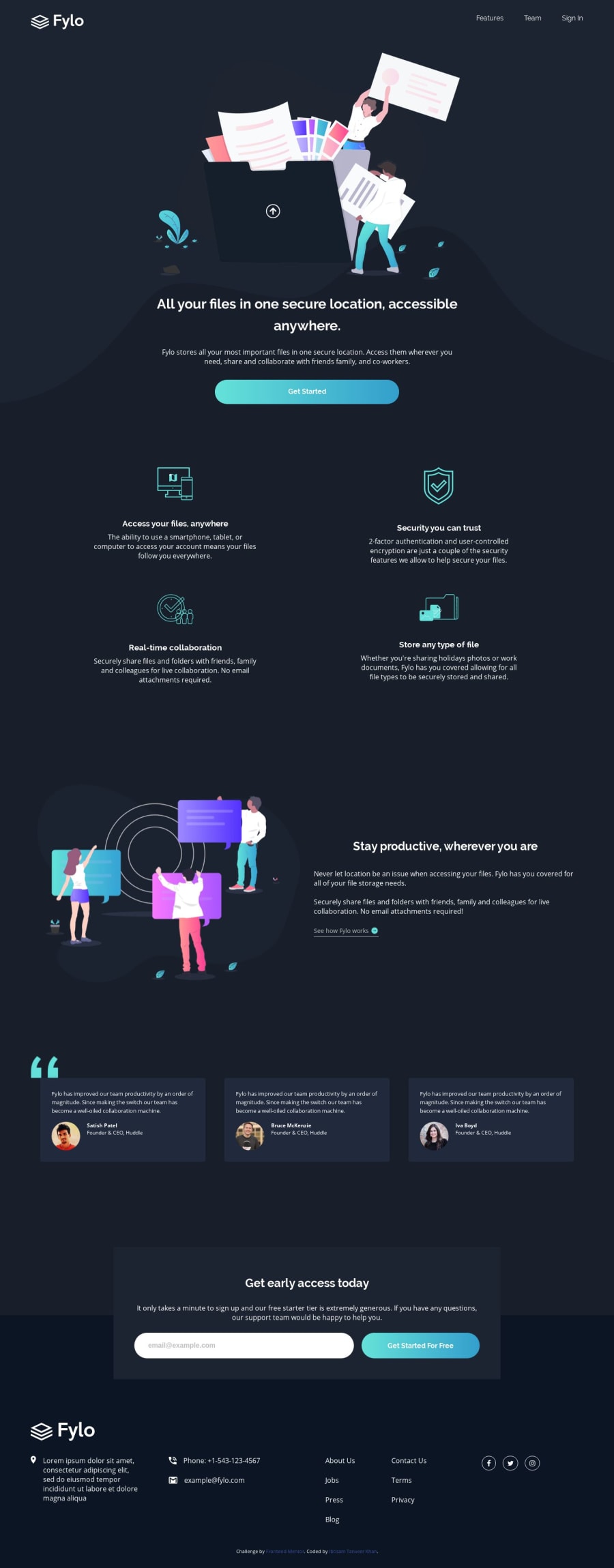
Responsive mobile first landing page with CSS Grid and Flexbox
Design comparison
Solution retrospective
Hi, I attempted this challenge using mobile first approach and designed it using CSS Grid and Flexbox. Please feel free to checkout the design, and I would be happy to receive your feedback. Thanks.
Community feedback
- @ovidiuantonioPosted over 4 years ago
Hello, nice solution, I love it! One thing you can add it's more padding at the top, to give the nav bar more "breathing space". That's all, nice job!
Happy coding! Keep going!
0@itkhanzPosted over 4 years agoThanks, it definitely needs more breathing space, I am gonna add it.
0 - @lailton-bPosted over 4 years ago
Hey, Ibtisam!
You did a great job, congratulations!
Just a tip: put the title "Stay productive, wherever you are" aligned to the left and it will be perfect!
0
Please log in to post a comment
Log in with GitHubJoin our Discord community
Join thousands of Frontend Mentor community members taking the challenges, sharing resources, helping each other, and chatting about all things front-end!
Join our Discord
