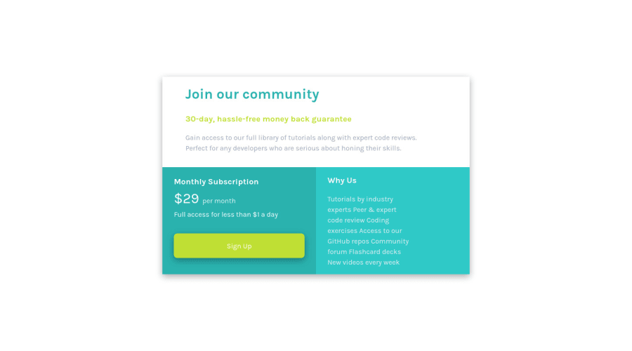
Responsive Mobile First Landing Page, Flexbox, Vanilla CSS
Design comparison
Solution retrospective
The solution is part of the refactoring and review of previous solutions. As always, all feedback is welcome!
Community feedback
- @VCaramesPosted about 2 years ago
Hey there! 👋 Here are some suggestions to help improve your code:
- This entire component should have been built using CSS Grid as the challenge name implies. If you are not comfortable using CSS Grid or do not know how use it, here is a link that is all about how to use CSS Grid:
https://css-tricks.com/snippets/css/complete-guide-grid/
-
Header Element is not needed in this challenge.
-
The “30-day, hassle-free money back guarantee” is not a heading. It should instead be wrapped in a Paragraph Element.
-
The “Why Us” list needs to be created using an Unordered List Element along with the List Items Element.
If you have any questions or need further clarification, let me know.
Happy Coding! 👻🎃
Marked as helpful1@Faris-ThibaniPosted about 2 years ago@vcarames Thank you for noticing that... CSS grid did not appear to be necessary to build this project.. but I can still use some practice with CSS Grid Thank you.
0@Faris-ThibaniPosted about 2 years ago@vcarames Tnx for recommending those tips the codes were executed. :)
0 - @chocolateflightPosted about 2 years ago
Nicely done! You did a good job copying the design. It is responsive, it is clear. That's very good.
Just one or two suggestions to maybe improve it a little bit:
-
Add a :hover effect to the .cta button, so that when I hover over the button I can see a change which indicated that it's an interactive element. You could even add an :active class that changes the button during my click
-
Maybe this is a browser thing, but in my Chrome-based browser, I see an arrow cursor when hovering over the CTA button. Maybe add a declaration to the CSS that changes the cursor to a pointer
-
In the design suggestion from FrontEnd Mentor, the corners of the container are rounded a bit. All it takes to do that is one simple CSS declaration to make this happen. Maybe you can make this work if you'd prefer the rounded design as well.
Overall, nicely done!
Marked as helpful1@Faris-ThibaniPosted about 2 years ago@chocolateflight Thank you, Marc the code was implemented :) Happy that you noticed these minor bugs.
0 -
Please log in to post a comment
Log in with GitHubJoin our Discord community
Join thousands of Frontend Mentor community members taking the challenges, sharing resources, helping each other, and chatting about all things front-end!
Join our Discord
