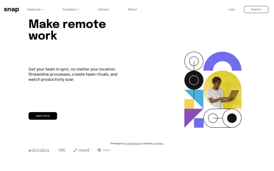
Responsive, mobile first into section with dropdown navigation
Design comparison
Solution retrospective
I'm glad that i can see the flow of this challenge clearly, even thought it is my first time doing it.
What challenges did you encounter, and how did you overcome them?It was hard, really. i need to learn dropdown and side bar from scratch. fortunately, with the help of youtube tutorials and chatGPT, i can do it.
What specific areas of your project would you like help with?When i made a dropdown for desktop mode, the dropdown list will disappear when my cursor made contact with the container, even thought my cursor also still in contact with the dropdown list. i figured out maybe i need to made the z-index the lowest and it worked, i was wondering if there is an alternative solution for this.
Community feedback
- @ALtera21Posted 6 months ago
Also, when clicking on the sidebar list on mobile, it always pop up this blue box, i tried to remove it using
ul:active {background-color: transparent;}but it didn't work, does anyone know how to solve this?0
Please log in to post a comment
Log in with GitHubJoin our Discord community
Join thousands of Frontend Mentor community members taking the challenges, sharing resources, helping each other, and chatting about all things front-end!
Join our Discord
