Responsive, Mobile First Approach Using Flex, Grid, CSS Variables

Solution retrospective
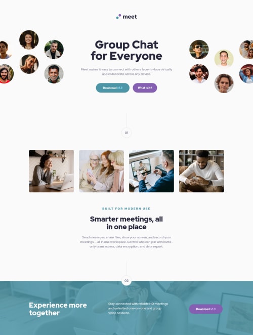
I decided to tackle this project with a mobile first approach, meaning I started coding the mobile design first then moved up to desktop. I thought it was going to be weird but it immediately started making sense and was a simpler way of doing things when having responsive design in mind. I think I will do the majority of my future projects this way.
My biggest problem was the background again. I feel like a broken record for saying this all the time, but here... it was truly something. Basically, in every design it overflows a little bit and I wanted to capture that, but boy was it a royal pain to realize.
All suggestions are read and acted upon! So lemme have it :)
Please log in to post a comment
Log in with GitHubCommunity feedback
No feedback yet. Be the first to give feedback on Arthur's solution.
Join our Discord community
Join thousands of Frontend Mentor community members taking the challenges, sharing resources, helping each other, and chatting about all things front-end!
Join our Discord