

Design comparison

Solution retrospective
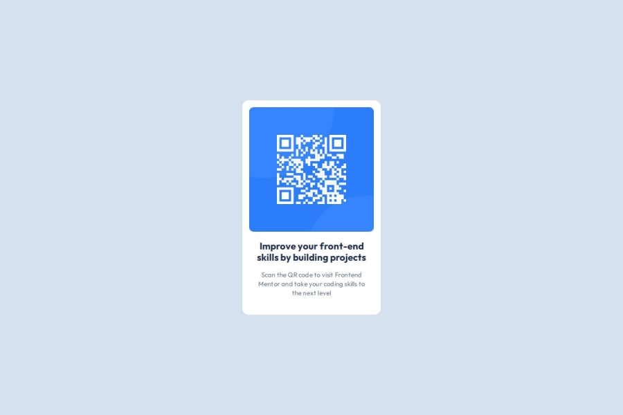
Completed without looking into solutions, it was fun fixing two circles to look good on small screens :)
What challenges did you encounter, and how did you overcome them?Absolute positioned elements were adding scroll to the mobile screen due to overflow, it took me a while to research and test but got it done
What specific areas of your project would you like help with?Just interesting to know if my solution is good for mobile screens 320px and what could I improve?
Community feedback
- @AJsemPosted 29 days ago
Well well well bro. Looks cool I would say. Nice idea or rather attempt to hard the circles. In the future you will probably learnt more on how this can even look more better with your incorporated idea, but just to chip in, 'a card is a card and is meant to be a card'... It is meant to have 4 edges of parallel equal sides... Your circles can come in as background to the card, then you put some little shadow on the card to bring it to life.
So for now, just stick with the default design bro and later on when you become pro you can back and make changes
Marked as helpful0P@dovlicioPosted 28 days ago@AJsem Hi, thanks for the feedback, really appreciate it! This wasn’t my idea for the circles—they gave us a Figma design that had those circles there. So, I’m not really sure why we got that Figma design if we’re not supposed to do it like that. :) But anyway, I’ll fix it for now like everyone else did.
1

Please log in to post a comment
Log in with GitHubJoin our Discord community
Join thousands of Frontend Mentor community members taking the challenges, sharing resources, helping each other, and chatting about all things front-end!
Join our Discord