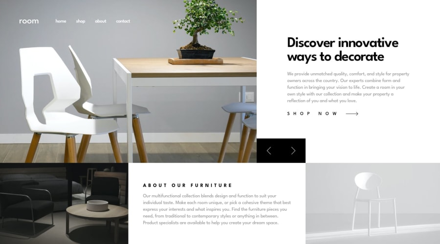
Responsive Mobile-First - room-responsive-homepage-master
Design comparison
Solution retrospective
The most difficult part of this challenge for me was the media queries. I suppose I made my life more difficult in this regard when creating my html - it could have been simpiler. But also I always find making my site responsive much more difficult when I use position absolute (because you have to give it a height and as Kevin Powell will tell you - giving heights are not great for creating a responsive page) but I really felt I had to use it here to set up the slides for my JS.
Setting up the slides in JS was a pleasure as I had enjoyed a lot of practice with carousels when I took Zell Liew's Free JavaScript Roadmap (which is awesome!) What he calls the "Early Teenage Phase" - he guides you to get a good learning base of 3 things: Image Carousels, Auto Complete/Type Ahead Search Bars and To Do Lists. So I plowed through as much information as I could find on youTube in these areas. Thanks Zell :).
Community feedback
Please log in to post a comment
Log in with GitHubJoin our Discord community
Join thousands of Frontend Mentor community members taking the challenges, sharing resources, helping each other, and chatting about all things front-end!
Join our Discord
