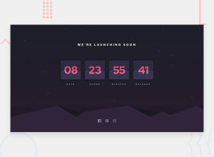
Responsive Mobile-First - launch-countdown-timer-main
Design comparison
Solution retrospective
This was super fun. I think I achieved most of the html and css as required but the background where the card is supposed to flip is not perfect.
For the social media svg's, I copied and pasted them right into my HTML and removed the "fill". Then in my CSS I put a fill of the grey and a hover - fill of the pink.
In order to get the footer image (which I did as a background-image) to match the mobile design, I had to change the background-size and background-position - which is always "fun".
I know my code could be less DRY by using this (and other things):
const values = [days, hours, minutes, seconds];
items.forEach((item, index) => { item.textContent = addZero(values[index]); });
...like John Smilga does in this video (which begins at 4:58 and is absolutely excellent - thanks John :)):
https://www.youtube.com/watch?v=3PHXvlpOkf4&list=RDCMUC8butISFwT-Wl7EV0hUK0BQ&start_radio=1&t=7768s
...BUT I am still learning and found my way easier to understand the basic concepts. I will try other solutions now on my own using dataset instead of class like Kyle (Web Dev Simplified) does and John Smilja's way to reinforce my knowledge.
I did try to do the Bonus, but sadly I didn't achieve it. I thought I could use the change event on an eventListener to transform: rotateX(180deg) on the display-box but apparently "change" only works on input and textareas. I will learn more about transform and animation etc. to try to figure this out.
Community feedback
Please log in to post a comment
Log in with GitHubJoin our Discord community
Join thousands of Frontend Mentor community members taking the challenges, sharing resources, helping each other, and chatting about all things front-end!
Join our Discord
