Responsive Mobile-First - bookmark-landing-page-master
Design comparison
Solution retrospective
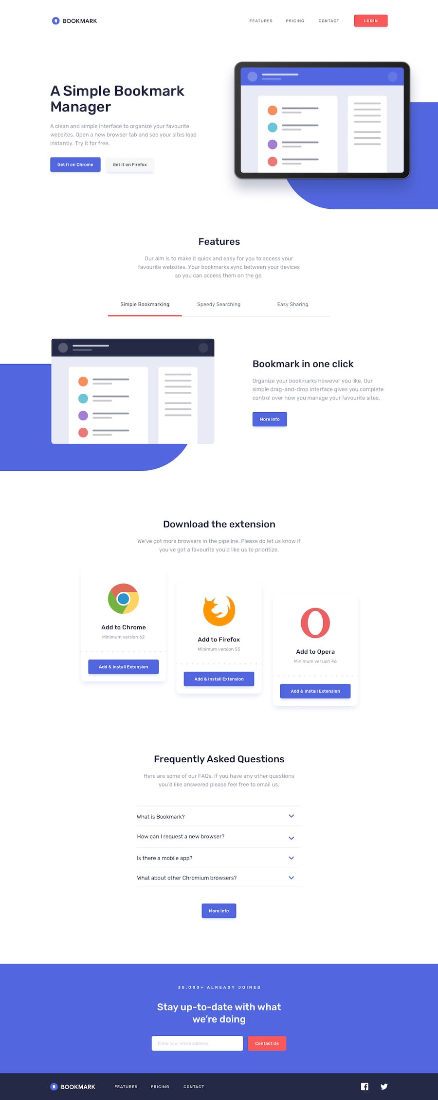
The "homemade" blue backgrounds gave me a fun challenge. First I made them as a div inside of a parent div which also held the actual image but because they could not fit inside my .container but then I changed them to just div's - position absolute - on the main. This way they could stretch outside of my .container. However, when it came to the tab-2 and tab-3 images I reverted back to creating its blue background inside the div which also holds the image because they needed to be slightly different in size to the tab-1.
To get the socials to be white and then red on hover, I had to remove the fill property on the svg in my HTML and set it to white in the css and red on hover.
The size of the hero svg just would not fill the entire width of it's div no mater what I did so I watched Kevin Powell's trio of videos on SGV's which are 6 years old but very relevant in my opinion. So I added a viewBox right into the SVG in my HTML: viewBox="68 10 520 600". This made the svg fill its parent div and was responsive when I made my screen size bigger. The most important thing I learned from this part was that the last 2 numbers in the viewBox control the zooming in and out so it is sort of the opposite of what you might expect in that the larger the number the smaller the image appears. I also had to add a width of 100% and height of auto to the svg in my CSS. The 3rd part of Kevin's video, which helped me the most for this, can be found here: https://www.youtube.com/watch?v=TBYJ2V1jAlA&t=8s
In order to get the FAQ question to turn red (and cursor: pointer) when the user hovers over anywhere on its parent, I used parent:hover .child {}. That was new to me.
Maybe I should have done the features nav with horizontal scrolling but I did it with JS instead although it doesn't look exactly like it is supposed to.
To get the red arrows I created another svg and turned the path: stroke to the red color we were given and in css I set rotate to 180deg.
For the FAQ section, my first attempt was through traversing the DOM but then I wasn't able to figure out how to hide an answer if one was open when I opened another. So then it was a relearning experience for me as I had learned something similar from John Smilga about a year ago (watch at 1:48 ... if you are brave enough :)): https://www.youtube.com/watch?v=3PHXvlpOkf4&t=8196s
I looped over the entire container which holds the question, the answer and both arrow btns using a forEach and while in the loop, I looked for that specific btn - by using the parameter (each item in the container) .querySelector instead of document.querySelector as I only wanted that specific btn and not all of them. Then I set an eventListener to that specific btn and did another .forEach on the entire container within the eventListener and did an if statement - if the container which I am looping through now is !== to the container which I am currently in, then remove the "show-text" class if it is there. And then outside of this second .forEach - in the eventListener on the btn I toggled the classList of "show-text" on the entire container. HOWEVER, the key thing here is the set up of the CSS. Obviously, the blue arrow and the answer are set to display: none and then I added a class of show-text set to display: block on the answer and the blue btn like this: .show-text .answer, .show-text .arrow-red {display: block} and I did the same for the blue arrow but set it to dislay: none. The to see if it worked before I even did the JS I went into my HTML and added - show-text to the entire container and sure enough the answer and red arrow appeared. Man, I LOVE this stuff!
Now, I am off to learn more about SVG's because the little that I did learn during my research for this project made me want to get a better grasp of it. And I think by creating my own svg's will help me understand others much better. Happy coding!
Community feedback
Please log in to post a comment
Log in with GitHubJoin our Discord community
Join thousands of Frontend Mentor community members taking the challenges, sharing resources, helping each other, and chatting about all things front-end!
Join our Discord
