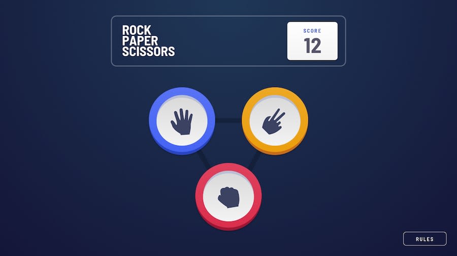
Responsive Mobile and Desktop Layout Using Tailwindcss
Design comparison
Solution retrospective
I encountered a significant challenge during the project when it came to positioning the rock, paper, and scissors options in my code, resulting in a delay of 45 minutes. What suggestions or improvements can you offer to address this issue and optimize the code for better performance?
Community feedback
- @jownsuPosted about 1 year ago
Hello there 👋. Good job on completing the challenge !
Your solution looks great, and you've done a fantastic job overall! However, I have other small suggestions to make it even better:
Instead of hardcoding the text for the winner. You can create an objects with rules on it and another one for the result.
const RESULT = {
    "tie": "Tie Game",
    "win": "You win",
    "lose": "House win"
};

const RULES = {
    "scissors"  : "paper",
    "paper"     : "rock",
    "rock"      : "scissors"
};

const [winner, setWinner] = useState(null);
Then you can make a function like this for computing the winner.
const calculateResult = (computerPicked) => {
    if(userPicked === computerPicked){
        setWinner("tie");
    }
    else if(RULES[userPicked] === computerPicked){
        setWinner("win");
        onWinCallback();
    }
    else{
        setWinner("lose");
        onLoseCallback();
    }
}
Then you can render the result text like this.
return (
    <div id="winner_text">RESULT[winner]</div>
)
I hope you find it useful! 😄
Happy coding!
0
Please log in to post a comment
Log in with GitHubJoin our Discord community
Join thousands of Frontend Mentor community members taking the challenges, sharing resources, helping each other, and chatting about all things front-end!
Join our Discord
