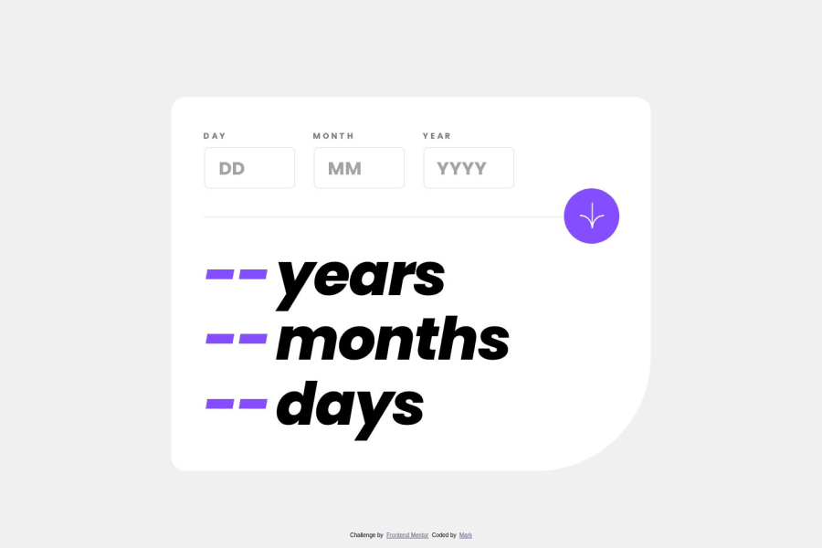
Responsive Mob\Desk Design using HTML,CSS(flexbox),JS
Design comparison
Solution retrospective
Firstly a big thank you to FrontEndMentor for this challenge! I found it quite fun to put together using vanilla html,css(flexbox) and js. The most difficult part of this particular design i found was the logic on hiding various elements like when to hide the label etc when using the mobile touch events where the click events were allot more straight forward. I added "console.log("....") at various stages to track the progress and looks like i have managed ok though.. I would greatly appreciate any feedback you might have.
Not sure if i have gone a little overboard here adding a sliding bar for mobile users to easily select the date but thought it logical considering it is much easier than manually entering in the digits. To top it off i also added have add animations where i found the UI to be quite simple, so making it as engaging as possible.
I hope you enjoy this little app, and have a good day!
Community feedback
- @daniel-web-developerPosted almost 2 years ago
That's a really nice project with cool animations!
There's a bug with the sliding bar, though. I tried inputting the numbers using only the slider and it said the fields were empty.
I have one suggestion regarding the <input> fields. I don't know if you prefer this way, but you can remove the arrows from the <input> boxes. You could do it by adding this to your CSS file:
input{
                appearance: textfield;
}
I'm not sure this will work in every browser. MDN Web Docs says it works on the main browsers (Firefox, Chrome, Safari, and Edge).
Last but not least, nice work!
Marked as helpful0@GHNetCodePosted almost 2 years ago@daniel-web-developer Hi Daniel, Thank you for your response and highlighting that, much appreciated. I was wondering if it would be nice to have the arrows as an option to toggle the numbers but yeah seems allot cleaner without them although the downside is the up\down arrows on the keyboard don`t work which is no big issue if the slider is the "theme" here i suppose , so I have removed them ok via the html document changing the input type using below example.: From: <input type="number" id="MonthBoxP"... To: <input type="text" id="MonthBoxP"...
In regards to the bug thanks for pointing that out, i have actually discovered 2 "Bugs" in regards to the slider with below issues and fixes.... 👍
1 : When sliding the bar forwards and then backwards from the beginning and then back to the original position the "onchange" function for the INPUT element was not firing which is technically correct. As a work around i have changed the default value to a space from a "0" and on testing it works. See below before and after changes..-: Before: ...type="range" min="01" max="31" value='0'... After: ...type="range" min="01" max="31" value=' '...
2 : Second "bug\issue" i found was if the button was pushed first so the msg\error appeared first, then when clicking on the DMY boxes the slider bar appeared ok however the msg\error stayed behind slider bar until the button was clicked again. Here i have listened out for events for the boxes and reset the msg\errors ok on a per box basis..
If you have the time, please do have another whirl and let me know if the issue is now resolve. :)
Cheers, Mark
Just an Update, In the end i removed the default (value="") attribute from the input field completely.
0@daniel-web-developerPosted almost 2 years ago@GHNetCode Hi! I tried using the slider bar again and now it worked. Good job!
0 - @GHNetCodePosted almost 2 years ago
After realising that the hover effect for the button the mobile device was sticking my work around which has worked so far is to pin point exactly when the hover effect should take place by using the media query in CSS. At least the "active" state works on both ok and is not a problem when the button is actually pushed.. For example-: /for devices that support hover effect with a mouse../ @media (hover: hover) and (pointer: fine){ #Btn:hover{ ..... } } /Only for devices that do Not support hover effect like touchscreens.../ @media (hover: none) and (pointer: coarse) { #Btn{ ..... } /* For all Devices when the button is pressed... */ #Btn:active { .... }
0
Please log in to post a comment
Log in with GitHubJoin our Discord community
Join thousands of Frontend Mentor community members taking the challenges, sharing resources, helping each other, and chatting about all things front-end!
Join our Discord
