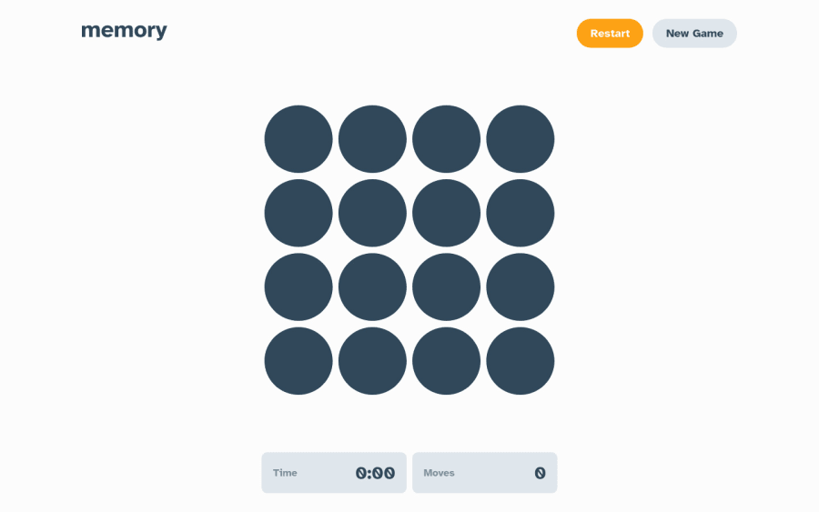
Responsive memory game using React/Material UI/TypeScript
Design comparison
Solution retrospective
Did everything I could to get it closely resembling the Figma mockups. There was heavy use of Material UI components and theming all throughout the app. I opted not to use the React context API for state management and instead just dealt with some prop drilling. I was sort of 50/50 on it but reading the React docs they recommend all alternatives and using it as a last case scenario when things get very complex. This helps with needless renders and better performance overall. For the icons I loaded a bunch of random ones in from the MUI Icon library. Definitely I recommend people use TypeScript when working with MUI and React. Helps a ton when developing!
Hope to hear all the feedback and recommendations.
Community feedback
- @chukwudobe-MicahPosted about 2 years ago
This is another very nice game, only thing I'll say is missing is highscore functionality. Maybe store highscore in local storage so user can only keep track of their progress for a nicer user experience. Regardless, this is beautiful!
Marked as helpful0P@webguy83Posted about 2 years ago@chukwudobe-Micah Thank you for your feedback! High score functionality wasn't part of the challenge requirements or bonus features so I didn't add something like that but that definitely is a thought for an extra feature on the side. Also determining a high score would be interesting because we'd have to consider the time it took to complete the matches along with the amount of moves required to make.
0
Please log in to post a comment
Log in with GitHubJoin our Discord community
Join thousands of Frontend Mentor community members taking the challenges, sharing resources, helping each other, and chatting about all things front-end!
Join our Discord
