Responsive Meet landing page with Vanilla CSS (Flex and Grid)


Design comparison

Solution retrospective
The mobile-first approach works really well. Once I had the mobile design I was able to move up very quickly. I might have solved the main content images just with flex. I'd probably try that in the future.
What challenges did you encounter, and how did you overcome them?It took me longer than expected. There were a few challenges:
-
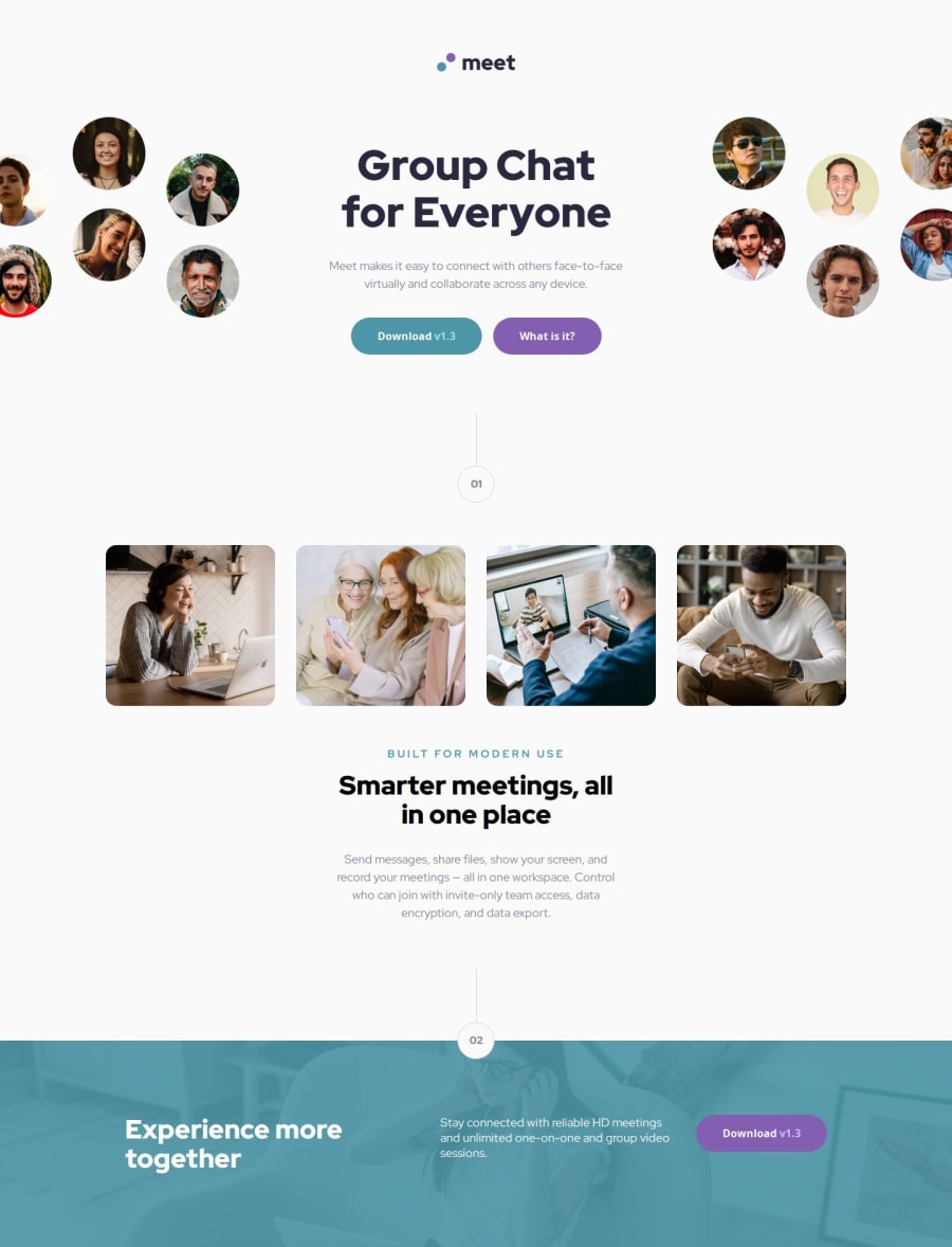
Having the two images in the desktop required doing some tricks with the
picturetag. I am not really comfortable with the solution I used. -
The footer image with the overlay was troublesome. Specially since it had to insert in the previous section. I believe the solution was elegant.
Is there a better way to solve the insertion below the 02of the overlay?
What is the best way to manage the change of images. In the CSS or HTML?
Community feedback
Please log in to post a comment
Log in with GitHubJoin our Discord community
Join thousands of Frontend Mentor community members taking the challenges, sharing resources, helping each other, and chatting about all things front-end!
Join our Discord