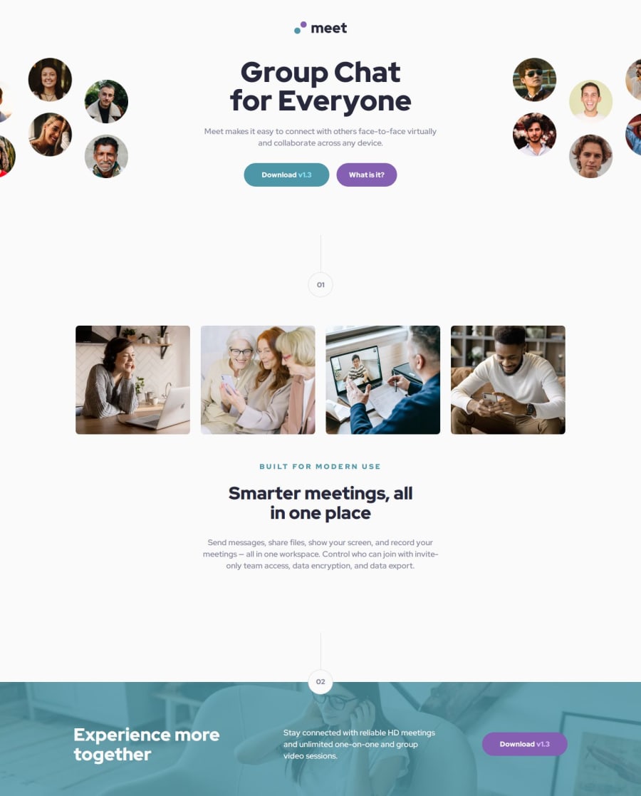
Design comparison
Solution retrospective
To be honest I'm not proud of this page at 100%. I had a lot of problems e.g. background image behaviour. Overall, it's looks nice comparing with the designed page.
What challenges did you encounter, and how did you overcome them?I had to create a lot of sass custom variables to change font sizes and make the page responsive.
What specific areas of your project would you like help with?I want to improve my solution but I am stuck. My code might be not clean for you. I get lost in it myself 😅
Let me know what do you think I should change in my solution.
How to deal with destroying page when zoom out? I used grid and stretched content to keep the page in place but I am not satisfied with it.
What is the best way to increase and decrease font sizes and paddings to make page responsive?
Community feedback
- P@NegligencePosted 6 months ago
All I can say is "I feel your pain" I want to help you, but I'm also struggling with the same thing to be honest 🤣
0
Please log in to post a comment
Log in with GitHubJoin our Discord community
Join thousands of Frontend Mentor community members taking the challenges, sharing resources, helping each other, and chatting about all things front-end!
Join our Discord
