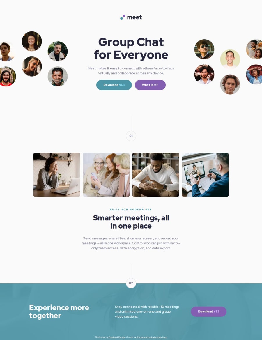
Responsive Meet landing page using Next.js 14 and Typescript
Design comparison
Solution retrospective
I started the project trying to use Sass and Tailwind together. After running into many errors and researching best practices, I realized it would be better to simplify the project. In the future, I will keep in mind that over-optimization can often be a hinderance.
What challenges did you encounter, and how did you overcome them?Trying to offset the hero image as it splits for the desktop view was tricky. I had to go back to the basics and research positioning on mdn. It helped me devise a solution that was much simpler than what I'd had before.
What specific areas of your project would you like help with?I feel pretty good about my solution. Any suggestions are welcome!
Community feedback
- P@tloyanPosted 6 months ago
You’ve made an awesome solution!
It makes me realize that focusing too much on the initial design can sometimes lead to unnecessary rules. I really enjoyed the breakpoints you chose and how you handled the responsiveness.
Seeing your code reminds me that CSS modules can be much cleaner compared to Tailwind.
1
Please log in to post a comment
Log in with GitHubJoin our Discord community
Join thousands of Frontend Mentor community members taking the challenges, sharing resources, helping each other, and chatting about all things front-end!
Join our Discord
