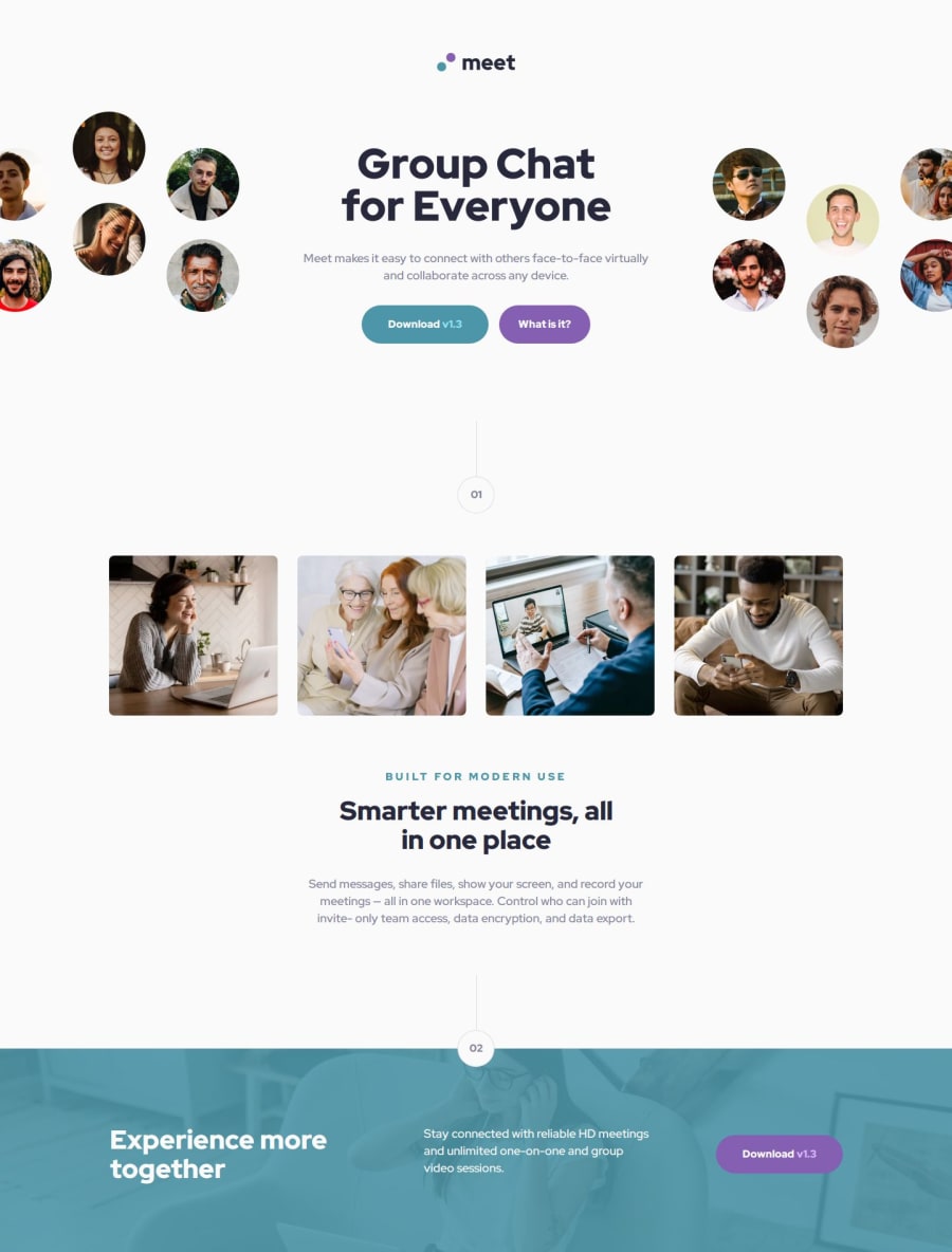
Responsive Meet landing page using Flexbox, scss and BEM
Design comparison
Solution retrospective
- I am proud that I successfully brought this project to the end. 🎉✅
- There were some challenges with the images, but nothing too difficult. 🖼️🔍
- Any advice would be appreciated. Thanks in advance! 🙏💡
Please log in to post a comment
Log in with GitHubCommunity feedback
- P@grifano
Hi, great job with the solution! Keep up the good work!
Here is a few improvements: The solution includes some semantic HTML, such as proper use of <section>, <header>, and <footer>. However, improvements can be made by ensuring each section has meaningful roles, such as using <main> for main content and limiting to one <h1> for SEO and accessibility.
Accessibility: Color contrast is generally good, but some improvements can be made by ensuring all images have descriptive alt texts. Add ARIA labels to interactive elements, like buttons, for better screen reader accessibility.
Layout on Different Screen Sizes: The layout is responsive and adjusts well across different screen sizes, from mobile to desktop. However, the text in some sections (like the subtitle under "Smarter meetings") could benefit from better spacing on smaller screens to avoid cramped appearance.
Code Structure: The code appears clean and well-organized, it can be improved for reusability by using more classes and CSS variables for commonly reused styles.
Design vs. Solution: The overall solution closely matches the design, though there are minor differences, such as I was mentioned before.
Join our Discord community
Join thousands of Frontend Mentor community members taking the challenges, sharing resources, helping each other, and chatting about all things front-end!
Join our Discord
