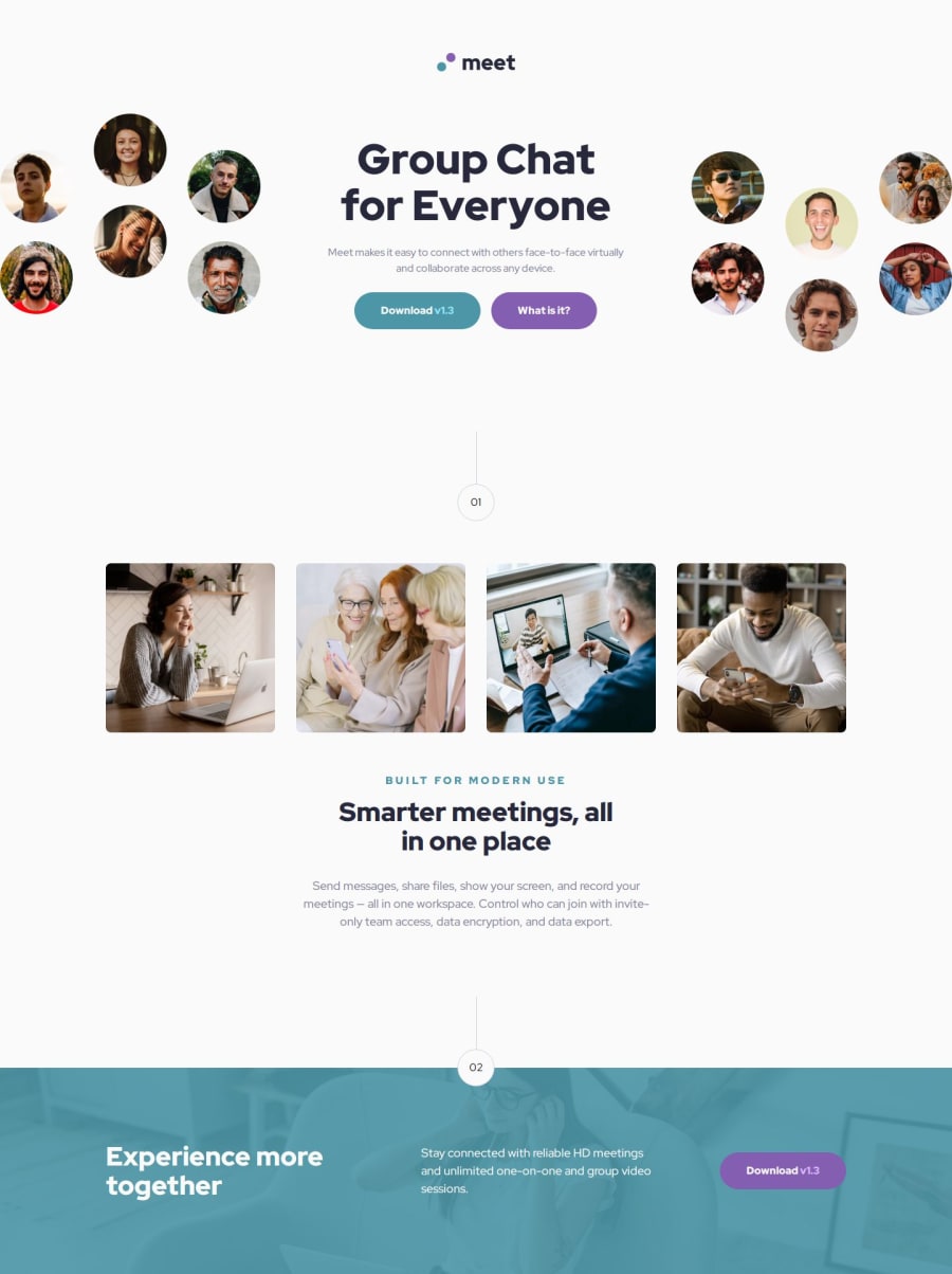
Responsive Meet Landing Page using CSS Grid
Design comparison
Solution retrospective
I'm more used to:
- naming the HTML and CSS class with BEM
- setting the display with different screen size
- flexbox and CSS grid
Different screen size have a different font size and padding size. Currently, I set the size by using media query for each different screen size. Maybe there is more efficient way besides using media query.
Sometimes I found it hard to choose the correct name class for the block of BEM. But I think maybe by exercising and doing more project will make me get used to it.
What specific areas of your project would you like help with?Is there a more efficient way to set the font size and padding size for different screen size besides using media query to set it one by one to match the design from the figma file?
Community feedback
Please log in to post a comment
Log in with GitHubJoin our Discord community
Join thousands of Frontend Mentor community members taking the challenges, sharing resources, helping each other, and chatting about all things front-end!
Join our Discord

