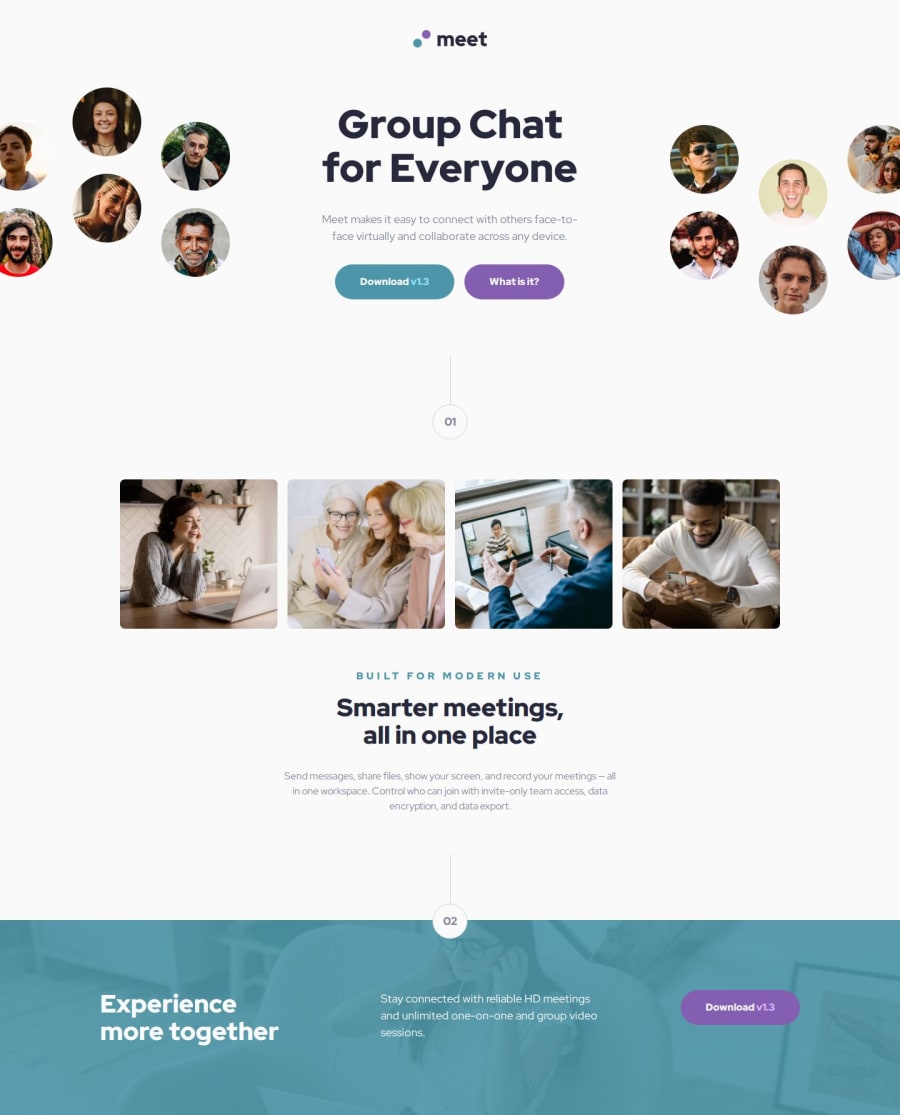
Responsive Meet Landing Page using BEM and Sass


Design comparison

Solution retrospective
In this challenge, I was able to implement everything what I have learned in HTML and CSS. I have implemented semantic HTML, responsive design, Sass and the BEM methodology in styling my elements. I was able to expand my knowledge on CSS and some techniques. I was able to position images in the way I wanted it too. I was able to structure my code for better readability and for separation of concerns.
What challenges did you encounter, and how did you overcome them?I found it hard to handle the images in this challenge. I wanted my solution to be as close to the design as possible. Thus, in some breakpoints I wanted my images to appear in the same way as what the design is showing. In some breakpoints, I wanted to hide some parts of the image rather than show the whole image on the page which I have struggled doing. After some googling, I have found some neat tricks to achieve the desired position of the images in a given breakpoint and I was able to implement it in my solution. Though, the footer image is still not the same in the design.
In the footer background, I overthought about blending the footer's background image and color, I have been finding a way on how to blend it according to the design using CSS blend modes. After some googling, I found out that you only have to use CSS opacity and z-index to implement such background styling.
What specific areas of your project would you like help with?I wanted to improve the implementation of the images and the number component of the page.
Listed below are my questions:
- What is the better way to implement the number component?
In my solution, I have a specific class called
.numberand I just plugged it to an element. Here is my code.
//CSS

.number {
    display: grid;
    place-items: center;
    position: relative;
    font-family: "Red Hat Display", serif;
    font-weight: 900;
    line-height: 1.5;
    color: #87879D;
    border: 1px solid #D1D1DF;
    border-radius: 9999px;
    width: 56px;
    height: 56px;
}

.number::before {
    content: "";
    position: absolute;
    top: -80px;
    height: 80px;
    border-right: 1px solid #D1D1DF;
}

//HTML
<p class="number main-content__number">01</p>
- What is a better way to handle the hero images? I thought the images in the hero section are decorative, so I have used divs with background images. I could have used img tags with empty alt attribute but I find using divs easier.
Here is my sample code
// HTML

<section class="hero">
  <div class="hero__img-mobile"></div>
  <div class="hero__img-desktop--left"></div>
  <div class="hero__text-content">...</div>
  <div class="hero__img-desktop--right"></div>
</section>
I styled my div images using some CSS background properties and I just hide and unhide some of the images based on the screen width using CSS media queries.
-
What is a better way to implement the footer background image? I have tried to match the footer image based on what's in the design but I wasn't able to achieve that. I think it is because of the provide image assets in the initial codebase provided.
-
How is my folder structure in this challenge?
Any suggestions and recommendations are also welcome.
Community feedback
- P@VirginiaPatPosted about 1 month ago
I am not sure I can give you the correct answers to your questions, as I am new in coding but I found your code pretty good. Try to check the 7-1 architecture in Sass for folder and file structure. Well done!
Marked as helpful0

Please log in to post a comment
Log in with GitHub
Join our Discord community
Join thousands of Frontend Mentor community members taking the challenges, sharing resources, helping each other, and chatting about all things front-end!
Join our Discord