

Design comparison

Solution retrospective
I'm proud to have built the first more complex page and to have got it so close to the original.
I didn't look at all the templates in detail at the beginning, except for the mobile template that I started with. This meant that I was missing a few flexboxes, grids and divs later on, which I then had to add in html. I will do this differently for the next project.
What challenges did you encounter, and how did you overcome them?I was working with a Sketch template for the first time and didn't want to take out a subscription for the software. Fortunately, there is the Lunyca app from Icon8, which can read both Figma and Sketch files and is also free.This allowed me to get much closer to the design template than before.
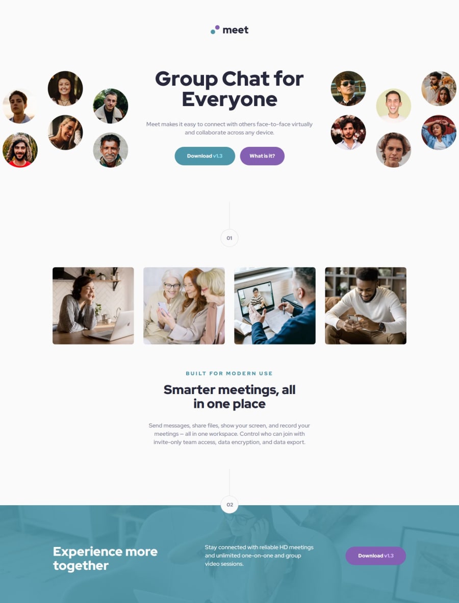
What specific areas of your project would you like help with?I have not found a solution for how to enlarge the header image with the heads of the people so that it goes a little over the frame on the left and right and is cut off at the frame. If anyone has any tips on this, I would be very grateful.
Community feedback
Please log in to post a comment
Log in with GitHub
Join our Discord community
Join thousands of Frontend Mentor community members taking the challenges, sharing resources, helping each other, and chatting about all things front-end!
Join our Discord