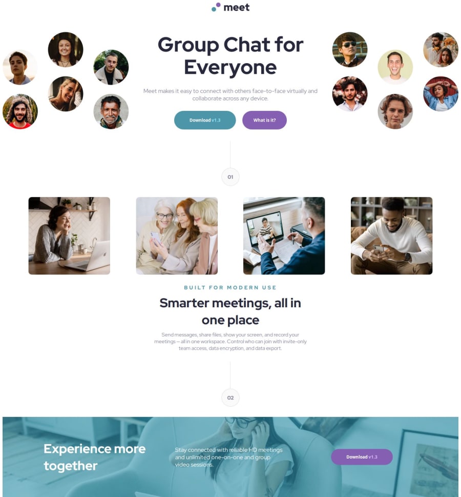


Design comparison

Solution retrospective
This was my first premium challenge. I learned a lot about using figma, grid layout, background image with colors and lot more. I am proud that i completed the challenge in 2days.
I would like to improve my speed in next challenge.
What challenges did you encounter, and how did you overcome them?Writing responsive code for images was challenging intially but using grid layout with proper width height solved the problem.
What specific areas of your project would you like help with?Working with image clipping and adding image above background(footer).
Community feedback
- P@juliusalbertoPosted 8 months ago
The solution uses semantic HTML - and it is certainly accessible (at least for me) (idk I don't have much experience with accessibility)
But it doesn't look good on different screen sizes :(. I tried using several screen sizes, and the header is bigger than the screen size.. I think you can improve the header by setting max-width (or something like that).
The paragraph and content is okay, but notice that the chapter line and circle (02) should be overlapping with the footer. I think you can do this by setting the margin to negative. The footer image should be smaller as well (yours have 2x the height).
The PC solution does not differ considerably from the design, but the mobile one can be improved further. Good luck!!
0

Please log in to post a comment
Log in with GitHub
Join our Discord community
Join thousands of Frontend Mentor community members taking the challenges, sharing resources, helping each other, and chatting about all things front-end!
Join our Discord