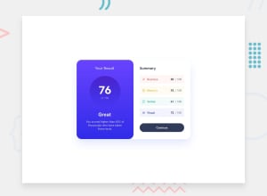
Design comparison
Solution retrospective
I found difficult to use different sizes than px and %. I would like to know how to manage better my sizes of text and containers. I couldn't get everything like in a description : my font-family is different, some colors might be different, sizes propably too and placement.
Community feedback
- @Only-CzesioPosted over 1 year ago
Leone Ricardo thank you for responding! I'm quite good thanks for asking and how are you?
I will apply those advices today and submit them again, last thing what i see i don't have it's this shadow around, how to achieve it?
0 - @Leone-RicardoPosted over 1 year ago
Good morning, Marek. How are you? About your challenge, try to add a background-color of the main container with a stronger tone of white, so that you can see if it is well formatted. And in the reaction and memory section, add a padding-left to match the other two sections. Put text-align: center in the attribution class. And add a cursor: pointer to the continue button. Increase the font size in the results section, and use different colors for the main title, of 100 and the description. Use the line-height, maybe tweak it and make it more like the challenge. Good studies! Stay hard!
0
Please log in to post a comment
Log in with GitHubJoin our Discord community
Join thousands of Frontend Mentor community members taking the challenges, sharing resources, helping each other, and chatting about all things front-end!
Join our Discord
