Submitted over 3 years ago
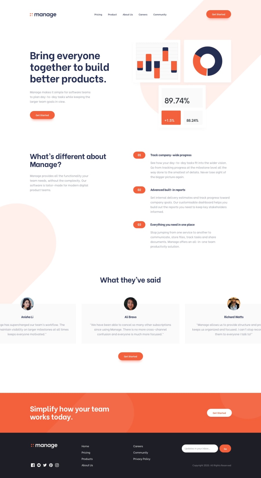
Responsive Manage Landing Page with HTML, CSS & JS
@sabin-baniya
Design comparison
SolutionDesign
Solution retrospective
Any feedback would be highly appreciated :)
Community feedback
- @tedikoPosted over 3 years ago
Hello, Sabin Baniya! 👋
Good job on this one! Your solution responds well and overall looks good. Here's my suggestions:
- Change the
altattributes for the.logo,.right-coland avatars images, as they don't add any extra context for screen reader users. Since your images are decorative youralttext should be provided empty (alt="") so that they can be ignored by assistive technologies. - Add
:focuspseudo class to interactive elements like anchors, buttons etc. Useoutlineproperty to make your website more accessible to keyboard users. Focusable elements like anchor, buttons or inputs they have applied default:focuspseudo class withoutlineproperty. These default styles are subtle and hardly visible tho. Furthermore every browser has a slightly different default style for the outline, so you probably want to change the default style. Read more about why we should change focus styles.
Good luck with that, have fun coding! 💪
0 - Change the
Please log in to post a comment
Log in with GitHubJoin our Discord community
Join thousands of Frontend Mentor community members taking the challenges, sharing resources, helping each other, and chatting about all things front-end!
Join our Discord
