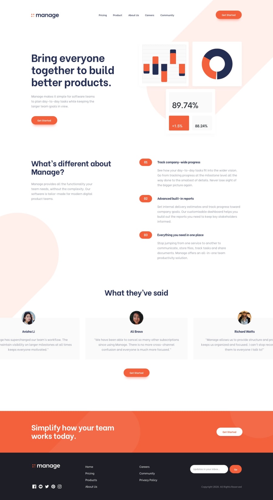
Responsive Manage landing page using Angular 18 & SASS
Design comparison
Solution retrospective
📌 In this funny Frontend Mentor Challenge I practiced a lot of layout organization using SCSS and the way of thinking in a reusable way following the DRY principle.
What challenges did you encounter, and how did you overcome them?💡 The main challenge was the implementation of the testimonials slider. The application of the scrolling animation only needs to be applied on large devices, while on mobile it was necessary to create a behavior more similar to a carousel.
What specific areas of your project would you like help with?I would love to get some feedbacks from you. Your insights would be incredibly valuable in helping me improve. Here are a few specific areas where I'd appreciate your thoughts:
📌 Folder Structure Management:
How effective is the current folder structure? Are there any changes you would suggest to improve organization and maintainability?
📌 State Design and Action Management:
What do you think about the design of the state and the way actions are managed? Are there any best practices or improvements you would recommend?
📌 SCSS Organization:
How is the SCSS part of the application organized? Do you have any suggestions for better structuring or optimizing the SCSS?
📌 Possible Improvements or Suggestions:
Do you have any general feedback or suggestions for improving the solutions I've implemented? Are there any areas where you see potential for enhancement?
Thank you so much for taking the time to review my work. Your feedback is greatly appreciated ❤️.
Happy code to everyone!! 😁
Community feedback
Please log in to post a comment
Log in with GitHubJoin our Discord community
Join thousands of Frontend Mentor community members taking the challenges, sharing resources, helping each other, and chatting about all things front-end!
Join our Discord
