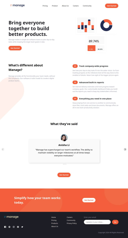
Responsive Manage Landing Page | HTML, SCSS with interactive Carousel

Solution retrospective
This is my first intermediate project!
This is a project I've always wished to create. I have been working on it for the last two days and finally it's done! The website has a responsive layout and a navigation bar that can be expanded using a hamburger menu along with an interactive testimonials carousel.
This project is built using SCSS and also uses Validator and Splide for different elements. I used Validator to validate the form at the footer and Splide to create an interactive testimonials carousel. The grid layout is simple and can be easily created and managed. But some elements require flex layouts along with pseudo elements to style them.
I want to start using mobile-first the next time I create a project. This time, I started desktop first but that didn't create lots of hassle.
What challenges did you encounter, and how did you overcome them?Making the footer was a little overwhelming at first. I felt like I could create it using the typical grid layout that I am used to. But, it did require a bit more work to create it. However, making everything responsive was an easy task.
I'm still a little worried about the responsiveness and paddings of my website. Some elements seem to be overflowing the screen but I tried to fix it. Hopefully it works.
What specific areas of your project would you like help with?As a beginner, I still have lots to explore and learn. This project has made me realize how much I need to learn. I'm looking forward to your valuable feedbacks on how I can create visually better and accessible websites.
Any suggestions on how I can improve are welcome! 😊
Please log in to post a comment
Log in with GitHubCommunity feedback
No feedback yet. Be the first to give feedback on Tharun Raj's solution.
Join our Discord community
Join thousands of Frontend Mentor community members taking the challenges, sharing resources, helping each other, and chatting about all things front-end!
Join our Discord