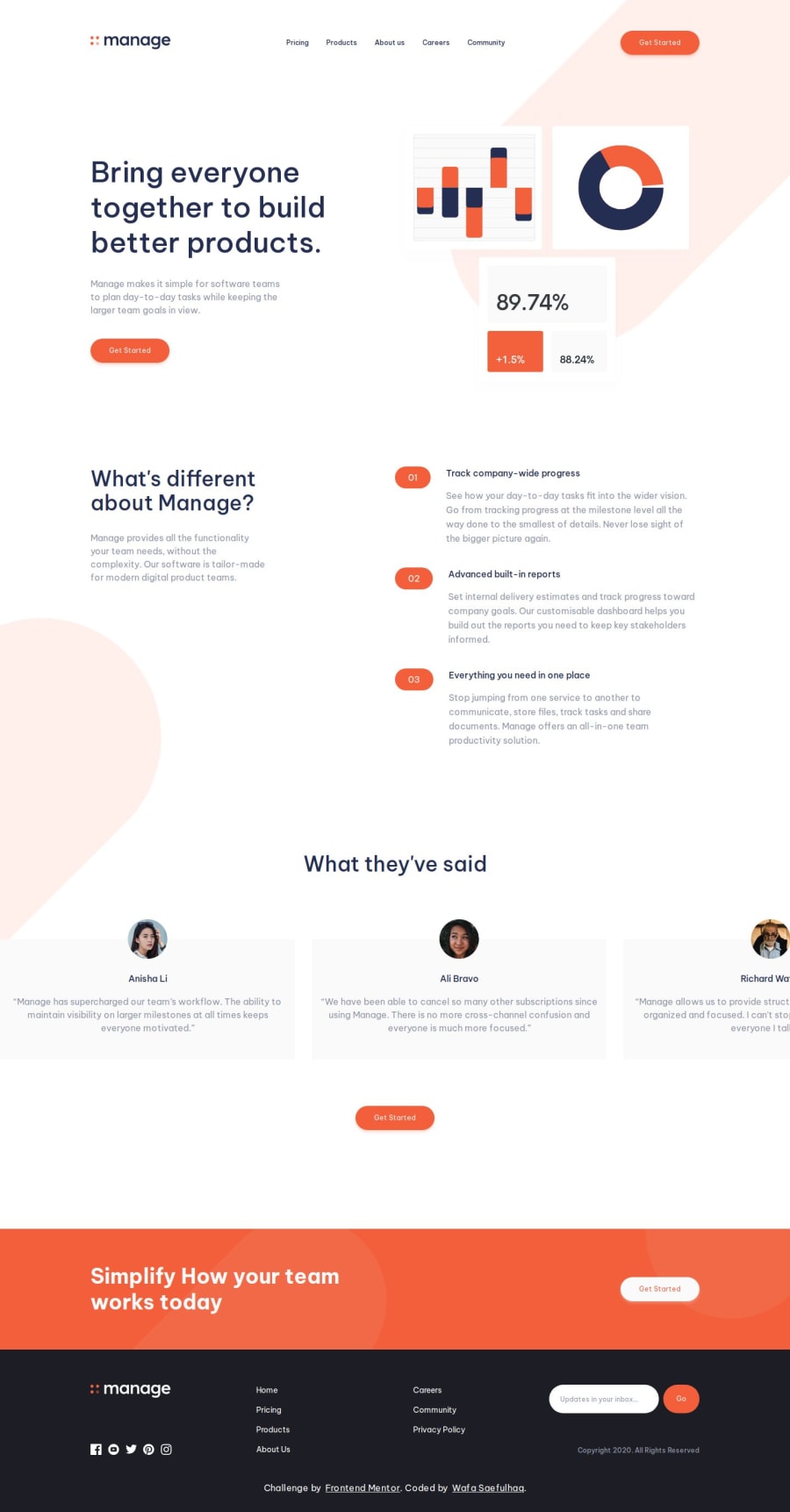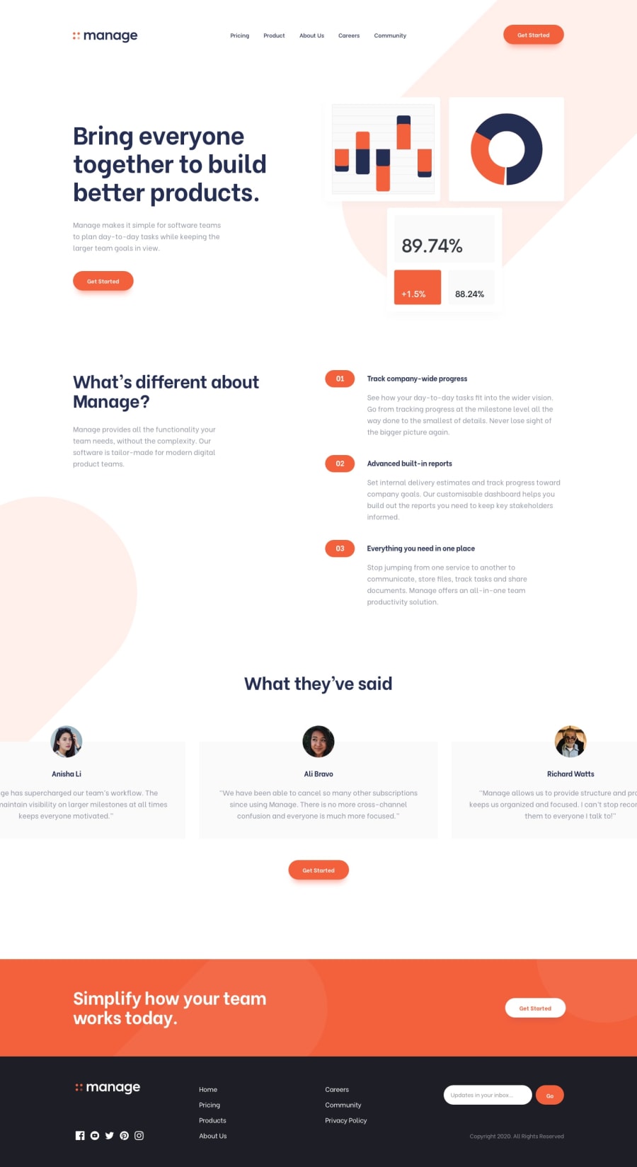
Design comparison
Solution retrospective
Your feedback is highly appreciated 🙌
Community feedback
- @JustynaKorzyckaPosted 10 months ago
Hi :) I found few things that could be improved:
- there are no horizontals paddings/margins - for some widths content is on the edge of the page.
- For mobile devices You can add closing the menu when clicking outside the menu area
- I suggest shortening the homepage code: exports static data to another file, create new components: heroSection, preFooter e.tc.
- pay attention to the heading hierarchy :)
Marked as helpful1@wafash08Posted 10 months ago@JustynaKorzycka, thank you for taking the time to review my project. here are my thoughts on the points you mentioned:
- t'll make sure to add horizontal paddings/margins to ensure a better overall layout and improved visual appeal. Actually the design has some padding/margins too and i forget to do so.
- initially i intended to add feature for closing the menu when clicking outside but i am confused how to do it correctly. if you have the resources related to that, i am grateful if you want to share it
- i totally agree with your suggestion, i'll refactor the homepage code
- thanks for pointing out the importance of heading hierarchy, it indeed needs to be improved as i have accessibility warning related to heading.
if you have any additional suggestions or if there's anything specific you'd like me to focus on, please feel free to let me know. thanks again🙌
0@JustynaKorzyckaPosted 10 months ago@wafash08 https://github.com/JustynaKorzycka/pomodoro/blob/main/src/components/Settings/Settings.jsx here I created something similar. The idea is to create overlay on the whole page (position fixed and z-index 1) and add onClick handler for closing menu and overlay. Next create second component with navigation with position absolute and z-index 2. Because we use z-index here, the onclick handler on overlay will not affect on navigation component. I don't know if this is the best approach, but it works. If you still have any doubts, let me know :)
1 - @RazaAbbas62Posted 10 months ago
Hi, your design looks good, but one suggestion that you should also change the color and style of scrollbar in the testimonial section.
That's just a suggestion :)
1@wafash08Posted 10 months ago@FazeenIjaz good idea, i'll try to change the scrollbar. thanks for the suggestion😁
1
Please log in to post a comment
Log in with GitHubJoin our Discord community
Join thousands of Frontend Mentor community members taking the challenges, sharing resources, helping each other, and chatting about all things front-end!
Join our Discord
