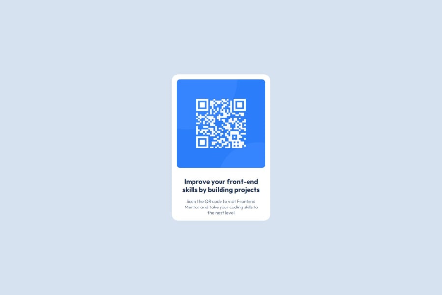
Design comparison
SolutionDesign
Community feedback
- @ErwiniaDevPosted about 1 month ago
Hello,
Forgive me, this is my first peer review...
The only thing I can see that might be missing is a padding-bottom on the bottom of your card.
Nice work I think!
0 - @mittens67Posted about 1 month ago
- The content can be wrapped in a semantic HTML element like <main> or <section>.
Ex:
<main class="main--page"> <div class="qr--cont"> ... </div> </main>This will enhance the site's accessibility by clearly defining the primary content area.
- The alt text is a bit generic. Making it more descriptive can help users relying on screen readers. Ex: alt="Scan this QR code to visit Frontend Mentor's website"
0
Please log in to post a comment
Log in with GitHubJoin our Discord community
Join thousands of Frontend Mentor community members taking the challenges, sharing resources, helping each other, and chatting about all things front-end!
Join our Discord
