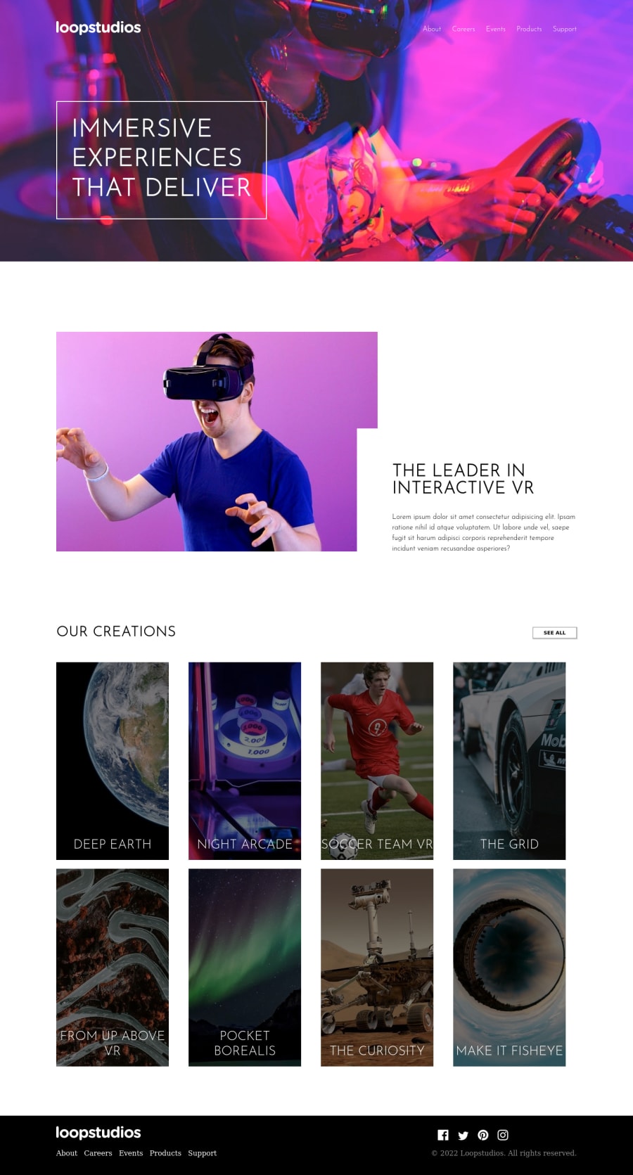
Design comparison
Solution retrospective
the hardest part is creating the responsive navbar. it took me like 3 hours to finish this section and im not really sure with the Creations sections, in the mobile design, the image looks bad. can anyone tell me the best practices for this section? thank you.
Community feedback
- @AdrianoEscarabotePosted about 2 years ago
Hi Maulana Sobari, how are you?
I really liked the result of your project, but I have some tips that I think you will enjoy:
- every Html document must contain the main tag, so we can identify the main content, to fix this, wrap all the content with the main tag. HTML5 landmark elements are used to improve the navigation experience on your site for users of assistive technology.
to improve the design you might consider using a
max-widthto hold the content at higher resolutions and preserve the project designThe rest is great!
I hope it helps... 👍
0 - @ozzy1136Posted about 2 years ago
I haven't done this challenge, but if you only get the desktop-size images, then you can use the object-fit and object-position CSS properties on the <img/> element in order to resize the photo.
If you also get the mobile-size images, then you can use the <picture/> element with media queries in order to tell the browser which image to use at which viewport size. More info at the MDN web docs: https://developer.mozilla.org/en-US/docs/Web/HTML/Element/picture.
Edit: You should move the divs with class "main" and "creations" into <main></main> elements for better semantics and accessibility. Read more about sectioning elements on the MDN web docs: https://developer.mozilla.org/en-US/docs/Web/HTML/Element#content_sectioning.
0
Please log in to post a comment
Log in with GitHubJoin our Discord community
Join thousands of Frontend Mentor community members taking the challenges, sharing resources, helping each other, and chatting about all things front-end!
Join our Discord
