Design comparison
Solution retrospective
This is my solution to this challenge, please help me to improve my skills. Comments and suggestions are welcome. Thank you!
Community feedback
- @nickcarlisiPosted almost 2 years ago
Hi Ibrahim,
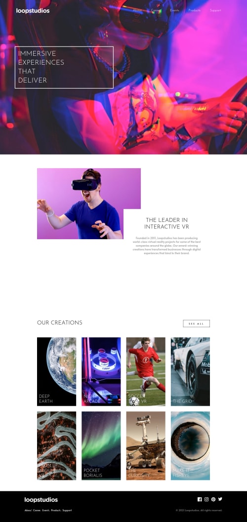
Good job! A few things I noticed that might help. For your grid, I think you might be over complicating it a bit, which is something I used to do myself. I noticed that you made your grid-template-columns: repeat (12, 1fr), and then each "box" spans multiple columns, but I recommend just setting the columns to the exact amount that you need. For example, on mobile, you can literally make your grid-template-columns: 1fr and then set a media query for desktop and change it to grid-template-columns: repeat (4, 1fr). That way you should be able to avoid setting the grid children to span columns and rows. They should automatically fall into place.
Another thing I would recommend is avoiding making the images in the grid background images. If you just make them images with a width and height of 100% and then add object-fit:cover, you should be able to avoid setting a specific height to your boxes. If you want to take it a step further, you can use the <picture> tag and set the srcset according to screensize to choose the "mobile" version at smaller screen sizes and the "desktop" at larger sizes.
Hopefully, those suggestions help. Happy coding!
0
Please log in to post a comment
Log in with GitHubJoin our Discord community
Join thousands of Frontend Mentor community members taking the challenges, sharing resources, helping each other, and chatting about all things front-end!
Join our Discord