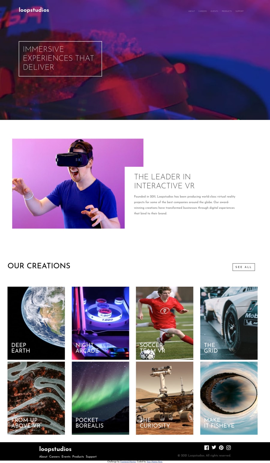
Design comparison
Solution retrospective
Any correction will be highly valued. THanks
Community feedback
- @AlexKMarshallPosted over 3 years ago
This looks pretty good. I like some of the little touches like the animated underline on the navigation links.
Your images are getting squashed though. Make sure you preserve their aspect ratio. It's happening because you're using background images and setting the background height and width to both be 100%. Look instead at using
background-size: coverwhich will crop the image while preserving its aspect ratio.The navigation bar text is tiny, that needs to be a lot bigger, it's barely readable. Make sure you don't use fixed px sizing for fonts. Use rems.
There's some overflow somewhere that's causing horizontal scrollbars above about 800px screen width.
The footer seems to be losing its padding at certain screen-sizes. Always use the dev tools to dynamically resize your screen, checking all areas of the page, to make sure it looks good at every size.
And make sure to fix the accessibility and HTML validation errors shown in the report.
Marked as helpful0
Please log in to post a comment
Log in with GitHubJoin our Discord community
Join thousands of Frontend Mentor community members taking the challenges, sharing resources, helping each other, and chatting about all things front-end!
Join our Discord
