Design comparison
Solution retrospective
Loopstudios Landing Page
Hey everyone!
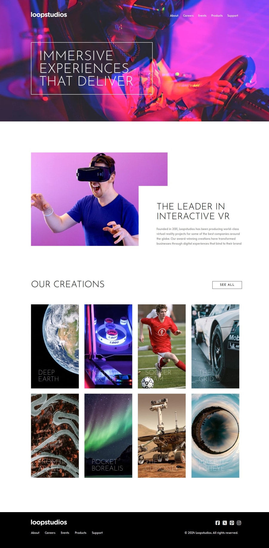
Overview: A polished landing page for Loopstudios, showcasing immersive VR experiences and world-class virtual reality projects.
Technologies Used:
#HTML
#CSS
HTML Structure: Header: Hero images for desktop and mobile
Navigation with logo and menu items (About, Careers, Events, Products, Support)
Header text: "IMMERSIVE EXPERIENCES THAT DELIVER"
Main Section: Interactive VR section with images and content about Loopstudios' leadership in VR
Descriptive text on the company's founding and impact
Article: Section titled "OUR CREATIONS" with a button to "SEE ALL"
Grid layout showcasing various VR projects (Deep Earth, Night Arcade, Soccer Team VR, etc.)
Footer: Social media icons
Navigation links repeated
Copyright notice
Styling and Functionality: CSS:
Responsive design elements for desktop and mobile
Hover effects for interactivity
Modern font usage and vibrant imagery
Thanks for your patience! Let’s keep the momentum going! 🚀
Community feedback
Please log in to post a comment
Log in with GitHubJoin our Discord community
Join thousands of Frontend Mentor community members taking the challenges, sharing resources, helping each other, and chatting about all things front-end!
Join our Discord
