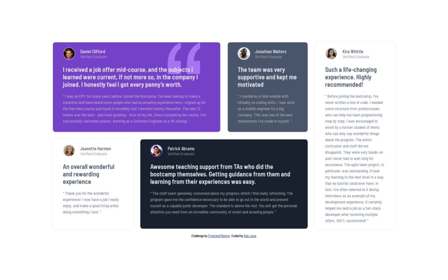
Responsive Light/Dark Solution for Testimonials Grid Section
Design comparison
Solution retrospective
I used grid to lay out the pattern it was a lot easier than trying to get flexbox to work for the scenario. Also, setup utility classes for backgrounds and text color changes so it can be used with card templates to stylize without having to write duplicate code for each card individually.
If I had to do again, I would probably look for a way probably with JavaScript to flow out the grid without having to assign sizes to individual cards, it would just add the class to the card and they would flow into place as needed.
What challenges did you encounter, and how did you overcome them?Nothing major within the challenge that I had an issue with. It was a pretty easy case to use grid for.
What specific areas of your project would you like help with?Nothing in particular, but will always take suggestions and critiques.
Community feedback
Please log in to post a comment
Log in with GitHubJoin our Discord community
Join thousands of Frontend Mentor community members taking the challenges, sharing resources, helping each other, and chatting about all things front-end!
Join our Discord
