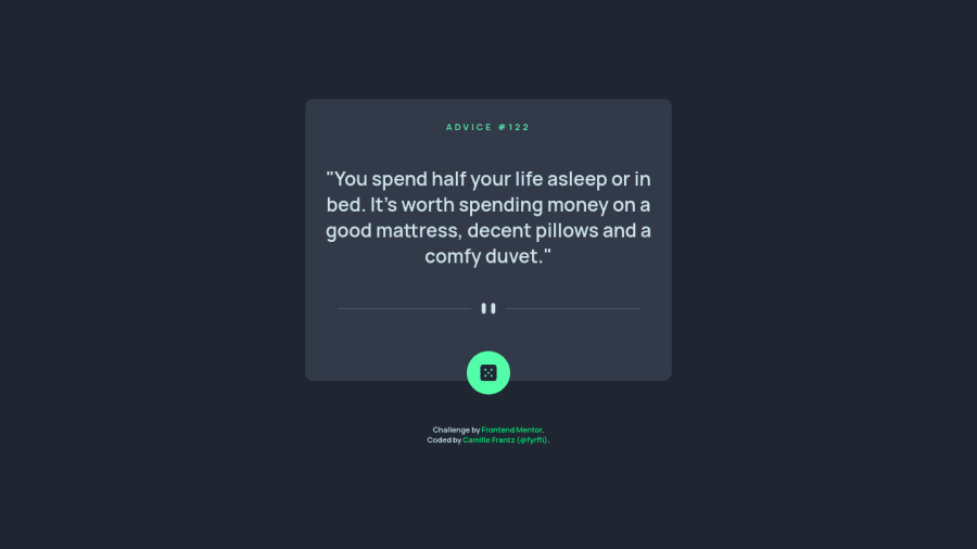
Design comparison
SolutionDesign
Community feedback
- @romila2003Posted over 2 years ago
Hi Camille,
Congratulations 🎉 for completing this challenge, your API component looks great and is functional. Also, it is great that you used the right semantic for your code. I have some suggestions, if you don't mind.
- You can wrap your button within a
buttontag and can store the image within it, instead of aptag asptags should contain texts instead. Also, you can give the button, acursorproperty to make it look more like a button e.g.cursor: pointer; - Instead of using a media query, you can give the
.card, amax-widthproperty e.g.
.card {
   max-width: 540px;
   width: 100%;
}

body {
   margin: 0 10px;
}
I gave the
bodyamarginproperty to prevent the card from touching the side of the screen.Rather than using the
margin-topproperty, you can use theflexproperty to center the card instead e.g.body { display: flex; align-items: center; justify-content: center; min-height: 100vh; }Overall, great work and wish you the best for your future projects so keep coding 👍.
1 - You can wrap your button within a
Please log in to post a comment
Log in with GitHubJoin our Discord community
Join thousands of Frontend Mentor community members taking the challenges, sharing resources, helping each other, and chatting about all things front-end!
Join our Discord
