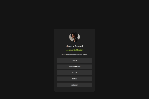
Responsive Layout without media queries for Social Links Profile

Solution retrospective
This was a plain and simple project not much to it. I used some variables for the fonts, font weight, and colors, so that if it was added to a larger project in the future, or the design changed, you only have one location to go to adjust the colors and font type. This can be expanded to include font sizes, padding sizes, etc.
What challenges did you encounter, and how did you overcome them?Didn't have any challenges in this one, more just debates between using buttons or a list of links, but ultimately landing on using links since it wasn't a form, and added the type attribute to the unordered list since the style was removed from them to make sure browsers still read them as a list for accessibility.
What specific areas of your project would you like help with?This was pretty straight forward, but will take any suggestions to make it better.
Please log in to post a comment
Log in with GitHubCommunity feedback
No feedback yet. Be the first to give feedback on Imnotdruish's solution.
Join our Discord community
Join thousands of Frontend Mentor community members taking the challenges, sharing resources, helping each other, and chatting about all things front-end!
Join our Discord