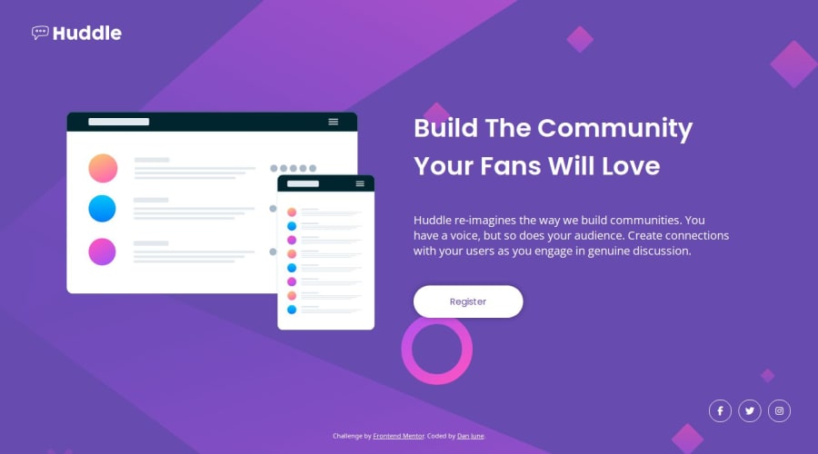
Responsive layout with scaling H1 for Huddle Landing Page Single
Design comparison
Solution retrospective
Decided to go with a clamp for the Heading to allow the font to scale up as the page scales and placed the breakpoint a lot later than normal (1200px) as I didn't like the paragraph wrapping that was occurring while growing it out.
I like it the way I have it, but their may be a better solution for the scaling up that limits the image more to give the paragraph more space instead of an even flex.
What challenges did you encounter, and how did you overcome them?I had some major things with positioning and the scaling, but just take a step back, cleared out some properties and went again. Typically a position or flow issue is because mine own error, so it's better to open dev tools in the browser, check what the settings are showing as there, then reevaluate the properties to make sure you not using something in the wrong place.
What specific areas of your project would you like help with?Nothing in particular, but will always take suggestions and critiques.
Community feedback
Please log in to post a comment
Log in with GitHubJoin our Discord community
Join thousands of Frontend Mentor community members taking the challenges, sharing resources, helping each other, and chatting about all things front-end!
Join our Discord
