

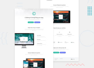
Design comparison

Solution retrospective
It has been quite a good challenge to flex the muscles
Community feedback
- @pikapikamartPosted about 3 years ago
Hey, awesome work on this one. Layout in desktop looks really great, it is responsive and the mobile layout looks really great as well.
Some other suggestions would be:
- The
altfor the website-logo should be using onlyalt="clipboard". When usingaltattribute, avoid adding words that relates to "graphic" such as "logo, icon, image.." no need to describe it as an image since it is already one. - The
altfor the computer should lose "image" word, you could use "computer using clipboard app" as a value, same goes for the below tablet and phone section, you can use "clipboard app on phone and tablet" as a value. - For the 3 icons below the tablet image should be using
alt=""as well as addingaria-hidden="true"on it, since the icon is just a decoration, you should just hide it. - For the company icons, just use only their name as the
altvalue. - Adding as well a
cursor: pointerfor each of thebuttonon desktop layout would be really great.
FOOTER
- Website logo should only use
alt="clipboard". - Those five links should be using their own
atag since they are supposed links. Also, you don't need to use separateultags for each of those. Those 5 links should only use 1ulelement, since they are related to one another. Usedisplay: gridon theulto place like those. - The social media links should be using
atag to wrap each of theimg. - Social media links as well should be inside a
ulelement, since those are "list" of links. - Each
atag that wraps the icon should have anaria-labelattribute, the value of this would be the name of the social media. For example, theatag that will wrap the facebook icon should look like:
<a href="facebook.com" aria-label="facebook">
 img inside here
</a>
This way users will know where this link would take them. You will see and use this method a lot, you use this when there is no text content inside the element, by doing this, you are giving like a text-description for assistive-tech to read. Also, have a search for
using sr-only on elements with no text-content.Aside from those, great work again on this one.
Marked as helpful0@JeremyWaruiPosted about 3 years ago@pikamart Woow! Thanks much. So alt value should just be a description of an image or logo? I will get myself to learn about the aria attributes. Thanks for the positive insights. I will implement.
0@pikapikamartPosted about 3 years ago@JeremyWarui Yes, but use only
altattribute if the image is meaningful and it adds content to the site, if that is the case, make a descriptivealtvalue.For logo, if it is a website-logo, you should always use the website's name as the
altvalue for it since it is one of the main content of your page.0 - The

Please log in to post a comment
Log in with GitHubJoin our Discord community
Join thousands of Frontend Mentor community members taking the challenges, sharing resources, helping each other, and chatting about all things front-end!
Join our Discord