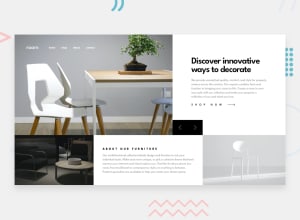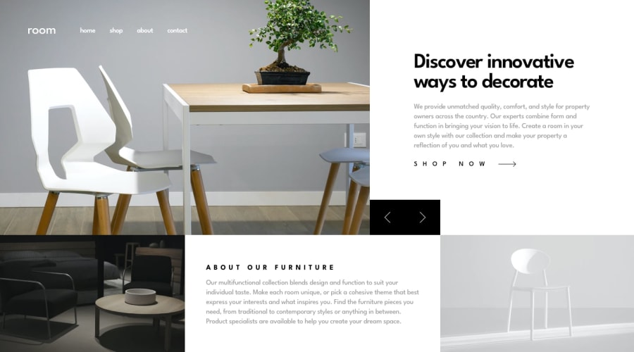
Design comparison
SolutionDesign
Solution retrospective
What are you most proud of, and what would you do differently next time?
Completing the challenge without using any layout frameworks was my goal and I have achieved it. If I were to do this challenge again, I'd consider a mobile first approach as that would've made completion easier.
What challenges did you encounter, and how did you overcome them?The transition from desktop to mobile was a bit of an obstacle. My goal was to avoid creating mobile-specific and desktop-specific elements, and purely transition using CSS. This was achieved using CSS grid layout.
What specific areas of your project would you like help with?Nothing, I'm happy with how it turned out.
Community feedback
Please log in to post a comment
Log in with GitHubJoin our Discord community
Join thousands of Frontend Mentor community members taking the challenges, sharing resources, helping each other, and chatting about all things front-end!
Join our Discord
