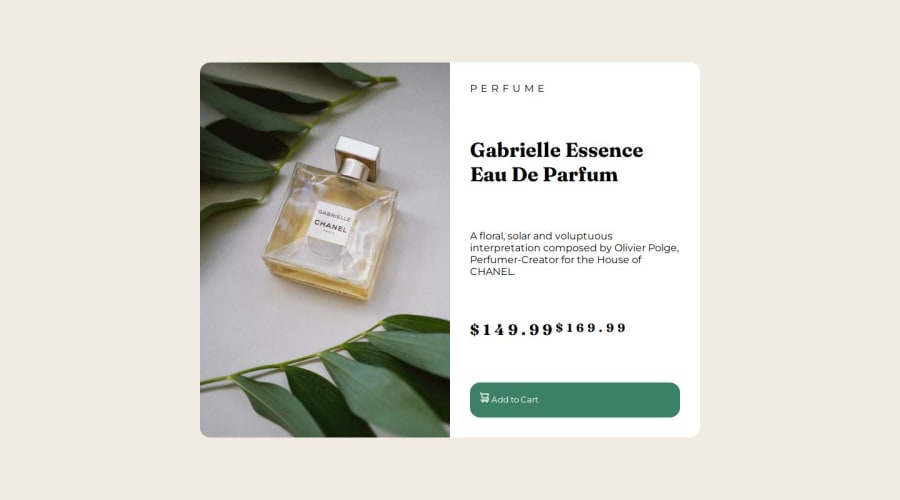
Responsive Layout using grid layout and media querys.


Design comparison

Solution retrospective
Grid layout was a little akward to use, but i'm surelly that it'll make more sense in a few more days
What challenges did you encounter, and how did you overcome them?Making a mobile first page was actually very challenging, trying to make it match with the desktop version after doing the style for the mobile was a fun challenge
What specific areas of your project would you like help with?i would like some help to match the texts in the desktop version
Community feedback
- Account deleted
Hi, there! 👋
Your solution for mobile screen sizes works nice. But you made the task more complex than it is. Text styles you applied to mobile screens work fine for desktop layout as well. That means, you don't need to use media queries that much. Since you stick with mobile first approach, I would propose to use only one media query with necessary adjustments to hit desktop screen sizes.
One extra tip 💡 :
- You overuse child combinator
parent > childselectors. It makes your code less reusable and readable
Marked as helpful1 - You overuse child combinator
- @MAY55APosted 8 months ago
Good work in general, clean code and semantic HTML included. These improvements can be made :
- make the card size smaller for the desktop layout, reducing the empty spaces.
- use only one media query for the desktop layout, and make the mobile layout the default and therefore only change the different properties without writing every style of all elements for each design (the button and prices in both layouts are similar so there is no need to alter them in the desktop version and only write their style once in the default layout - which is the mobile one -).
- if you are having trouble with the grid layout in the desktop layout, you can use a flex display in the second column of the grid instead of dividing it into rows.
0

Please log in to post a comment
Log in with GitHub
Join our Discord community
Join thousands of Frontend Mentor community members taking the challenges, sharing resources, helping each other, and chatting about all things front-end!
Join our Discord