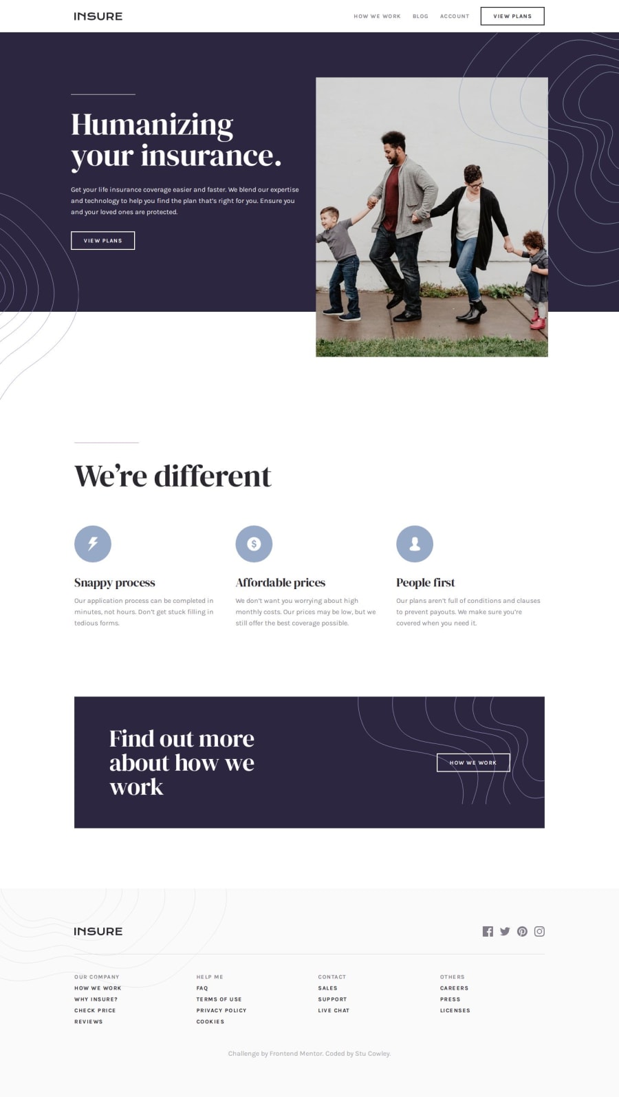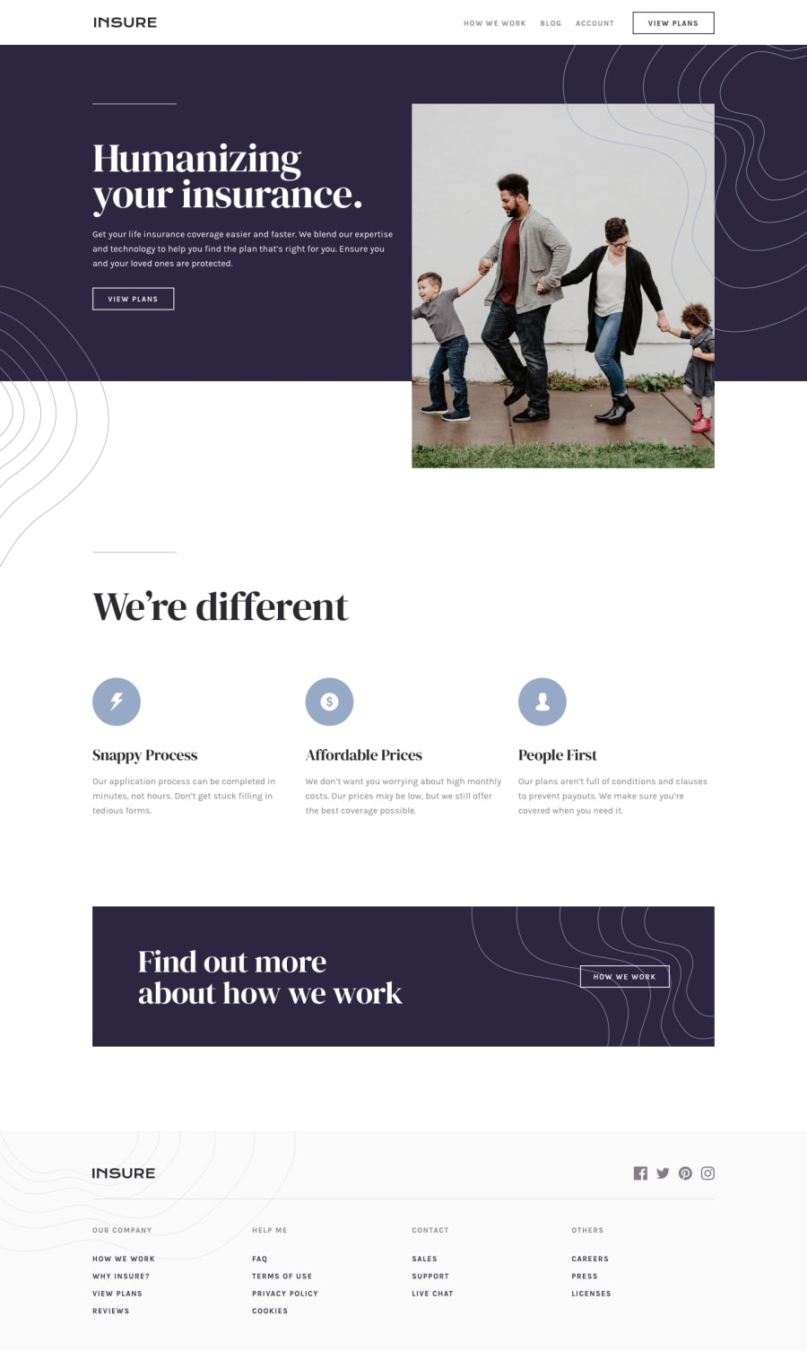
Responsive layout using grid, flexbox and Sass
Design comparison
Solution retrospective
The part of this project I am quite proud of and really challenged me was the mobile menu. I have always wanted to create a full sized mobile menu when toggled open.
What challenges did you encounter, and how did you overcome them?Eh, the hero patterns really did my head in, I thought about giving up and not including them, but with some reflection and time away I was able to overcome them and add them to the project. I know that they will be incorrect and look 💩 on bigger viewports, but hey they're there 🤭
Other than that, I didn't have any issues with any other parts of the project. I was quite happy with how it turned out.
What specific areas of your project would you like help with?If anyone could point me in the direction of any tutorials on how I can correct do background patterns it would be greatly appreciated.
Community feedback
Please log in to post a comment
Log in with GitHubJoin our Discord community
Join thousands of Frontend Mentor community members taking the challenges, sharing resources, helping each other, and chatting about all things front-end!
Join our Discord
