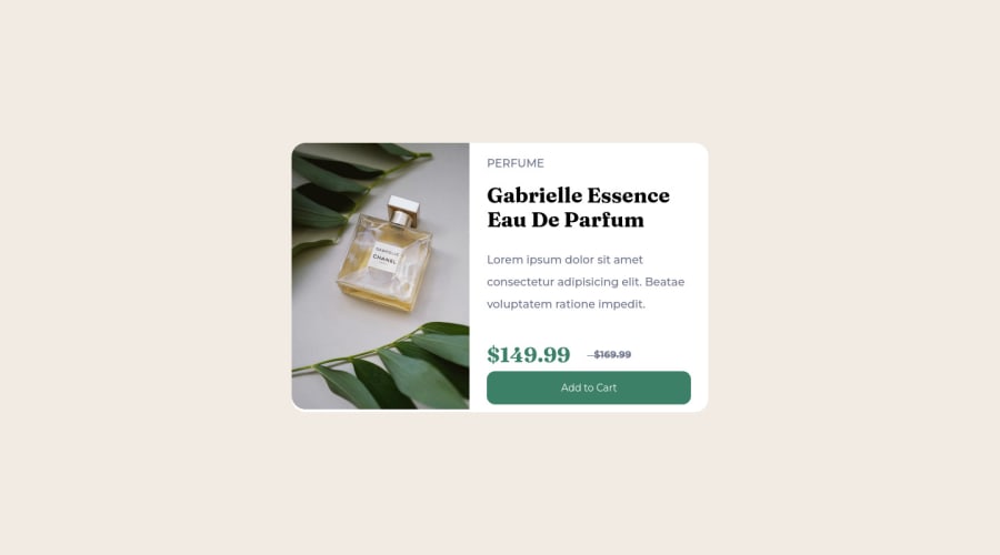
Design comparison
SolutionDesign
Solution retrospective
Nothing difficult. Thats was really easy for me. Used Scss
Community feedback
- @IrfanAshraf-proPosted over 2 years ago
Hi @candybuy, The card sure looks great. But around 370+ the image and the button behave very odd. 😔 Don't know about sass otherwise would have helped :)
0 - @fatlindshehuPosted over 2 years ago
Hi @candybuy
Nice work with the component, I think you need to be more carefull with the spaces between elements!
- I would suggest
measuring heights/widths & paddings/marginswith more precision, using a tool like FIGMA or Adobe XD helps you a ton! - Try not to use two images for two different screen sizes, instead make the image responsive by setting its width/height with
%.
Keep up the good work :)
0 - I would suggest
Please log in to post a comment
Log in with GitHubJoin our Discord community
Join thousands of Frontend Mentor community members taking the challenges, sharing resources, helping each other, and chatting about all things front-end!
Join our Discord
