Submitted over 2 years ago
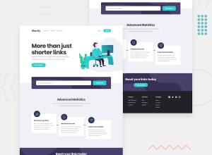
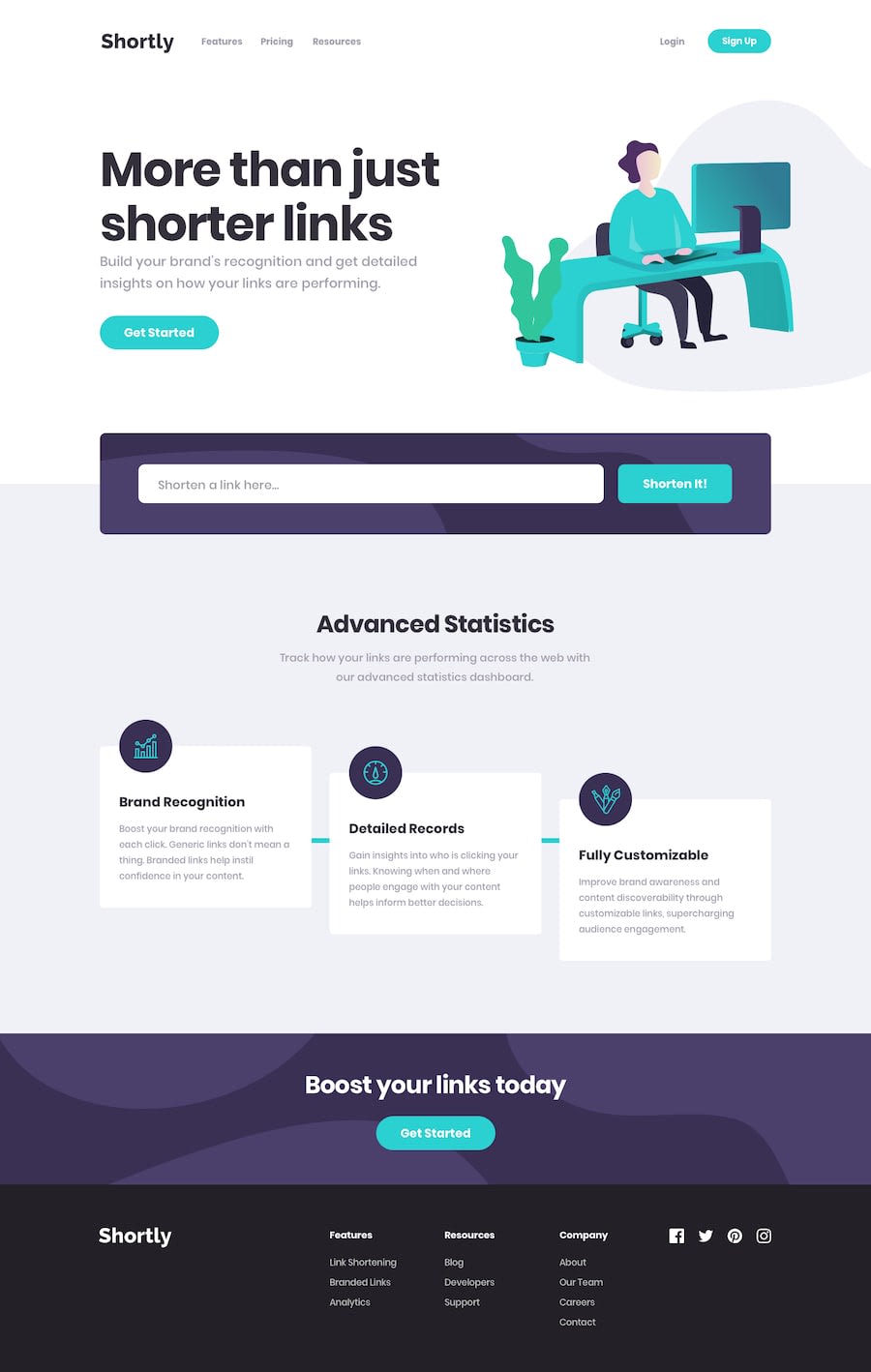
Responsive layout using flexbox, API request using axios, React JS
@eric-ricky
Design comparison
SolutionDesign
Community feedback
- @karthik2265Posted over 2 years ago
Nice work,
looks great on mobile 📱. The feedback to the user showing 'loading...' is a great idea. It's important to show user whats happening in the app.
somethings you can improve are add a little padding to the title 'More than just shorter links' in desktop, in mobile it looks fine. if the link pasted by the user is very long, it breaks the link component and it does not show copy button.
Thank You
0
Please log in to post a comment
Log in with GitHubJoin our Discord community
Join thousands of Frontend Mentor community members taking the challenges, sharing resources, helping each other, and chatting about all things front-end!
Join our Discord
