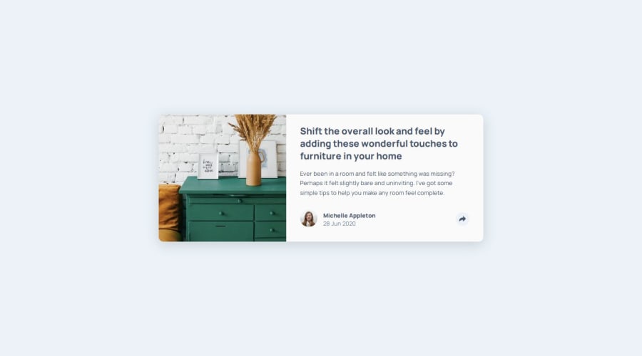
Design comparison
Solution retrospective
This challenge was difficult in that I was not sure how to transition the share buttons from the mobile layout to a desktop layout. Once more, I have started from the mobile view, however I feel as though it would have been quite a challenge going from either layout to another.
It was a challenge because it is hard to decide how to manage the pop-up. Starting in either view is easy, as you simply base it off the parent that it may be nested under, but the location changes completely once in the other view. One solution I was thinking of was to simply have two of these, and just disable one when the layout changes. Having two of those to update seemed counter-productive, though, so I tried to keep it to juse a single one.
I was also considering using JavaScript to move the element around, as to base it on another parent per layout. That probably would have worked, but seemed overkill for this simpler project.
What I ended up doing was giving the element an absolute position, and just manually tweaking the location until it was centered where I wanted it to be. This solution does not feel great to me, as any layout change will end up messing it up, however the card has a set with at the desktop, and the mobile view is fine because it is contained within its parent anyway.
I cannot say I am really proud of the solution I came up with, but I felt as though it was the simplest to implement without going overkill on JavaScript or creating duplicate elements.
Community feedback
- P@jamiethomas1Posted 7 months ago
I can see you had the same dilemmas as I did around which containing block the share div should have. I like the transitions you've added for the button & share icons. Great job
0
Please log in to post a comment
Log in with GitHubJoin our Discord community
Join thousands of Frontend Mentor community members taking the challenges, sharing resources, helping each other, and chatting about all things front-end!
Join our Discord
