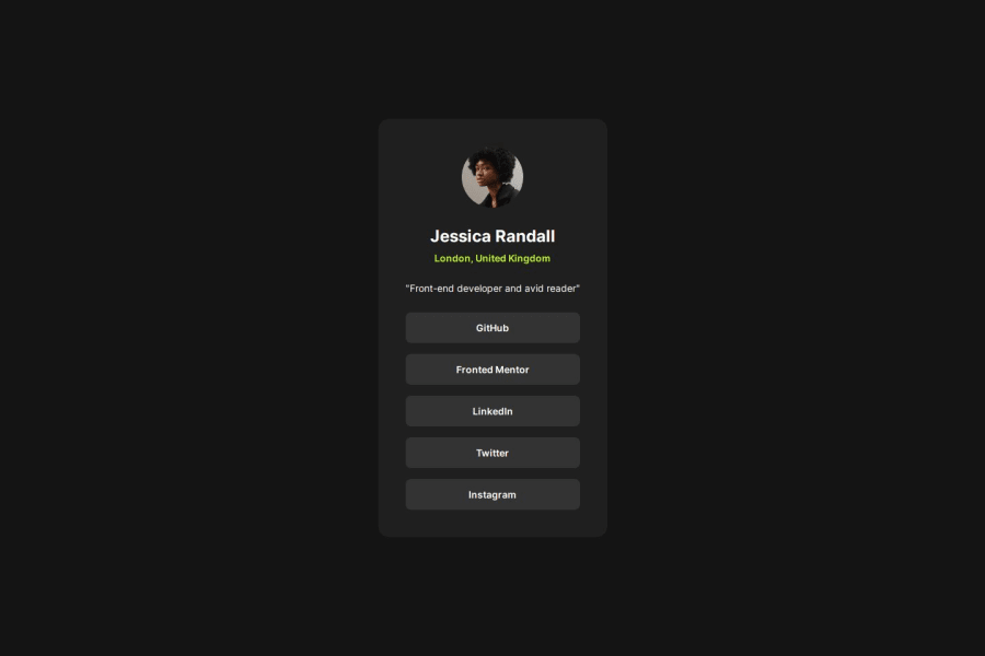


Design comparison
SolutionDesign

Solution retrospective
What are you most proud of, and what would you do differently next time?
I feel I have become more familiar with container and card design through practice and can now use 'gap' to set the distance between flex items instead of setting margins individually. Next time, I believe I can think even more about how to handle responsive layouts.
What challenges did you encounter, and how did you overcome them?No particular challenges were encountered this time.
What specific areas of your project would you like help with?I want to know if there's anything I can improve in the current responsive layout. I've only set up two screen sizes, and the visual changes on the screen aren't as smooth as I expected when testing different screen sizes.
Community feedback
Please log in to post a comment
Log in with GitHub
Join our Discord community
Join thousands of Frontend Mentor community members taking the challenges, sharing resources, helping each other, and chatting about all things front-end!
Join our Discord