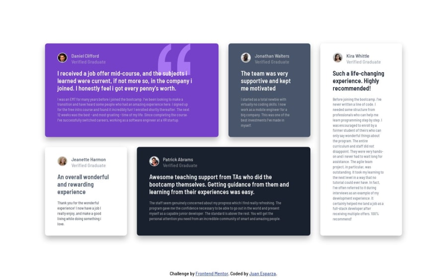
Design comparison
Solution retrospective
I still have a lot to improve in writing css. Any feedback is welcomed
Community feedback
- @MelvinAguilarPosted over 1 year ago
Hello there 👋. Good job on completing the challenge !
I have some suggestions about your code that might interest you.
- Remember to update the alt attribute with the correct name of the person.
-
The
altattribute should not contain the words "image", "photo", or "picture", because the image tag already conveys that information.If you want to learn more about the
altattribute, you can read this article. 📘.
-
Why the first testimonial is an
<h1>? Theh1tag is typically reserved for the most important heading on the page, which often reflects the main topic or purpose of the content. Using a testimonial as the h1 might not accurately represent the overall content and purpose of the page.If you still want to have an h1 element for SEO purposes and can't find a specific heading that fits, you can use a visually hidden class (commonly called sr-only) to hide it from the visual display while still making it accessible to screen readers. You can find styles for the sr-only class at CSS-Tricks. For example:
<h1 class="sr-only">Testimonials Grid Section</h1>
I hope you find it useful! 😄 Above all, the solution you submitted is great!
Happy coding!
1
Please log in to post a comment
Log in with GitHubJoin our Discord community
Join thousands of Frontend Mentor community members taking the challenges, sharing resources, helping each other, and chatting about all things front-end!
Join our Discord
