Submitted almost 3 years ago
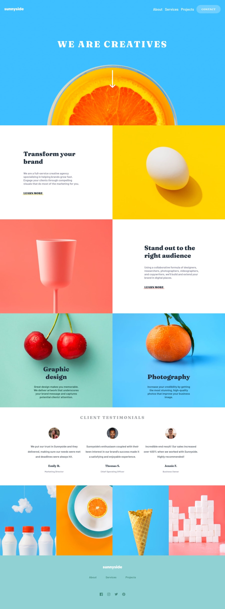
Responsive layout using CSS Grid & Flexbox & little bit of JS
P
@katrien-s
Design comparison
SolutionDesign
Solution retrospective
Gosh, I struggled on this one. And also applauded myself various times. I'm delighted with the result, but nevertheless I have a list of mistakes/errors I don't know how to solve. I didn't finish this excercise in one day. I'm working full time, juggling a few extracurricular activities, so time is limited. It made me loose oversight, which I handled by using a to do-list. So this solution in my head, feels messy.
The issues I didn't manage to solve:
- The size of the images inside the main grid are off on tablet view. I assumed it had to do with me setting a
max-width: 100%. But when I changed that, I still couldn't fix the height. How would I solve this? - The
nav-toggledidn't wanted to disappear if I would setdisplay:noneso I had to usevisibility: hidden. But why didn't thedisplay:nonenot work? - The contact-button on the sidebar doesn't want to change its colours on hover. Yet it does on click?
Community feedback
Please log in to post a comment
Log in with GitHubJoin our Discord community
Join thousands of Frontend Mentor community members taking the challenges, sharing resources, helping each other, and chatting about all things front-end!
Join our Discord
