Submitted almost 3 years agoA solution to the Skilled e-learning landing page challenge
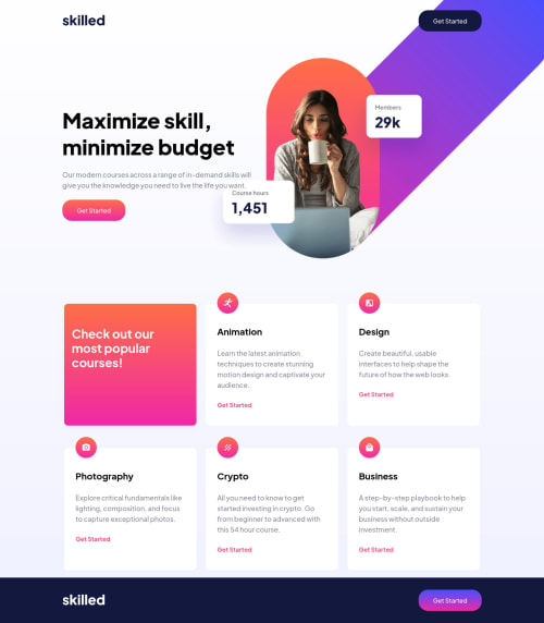
Responsive layout using CSS Grid
P
@giropa832

Solution retrospective
It took significantly more time than estimated to get this design about right.
My main challenges have been:
- How do I properly place the hero images?
- It is CSS Grid the best solution to use here?
- How do I design for a proper view on mobile? Should I start the mobile version and move up or do the opposite?
Code
Loading...
Please log in to post a comment
Log in with GitHubCommunity feedback
No feedback yet. Be the first to give feedback on Jeronimo Palacios's solution.
Join our Discord community
Join thousands of Frontend Mentor community members taking the challenges, sharing resources, helping each other, and chatting about all things front-end!
Join our Discord