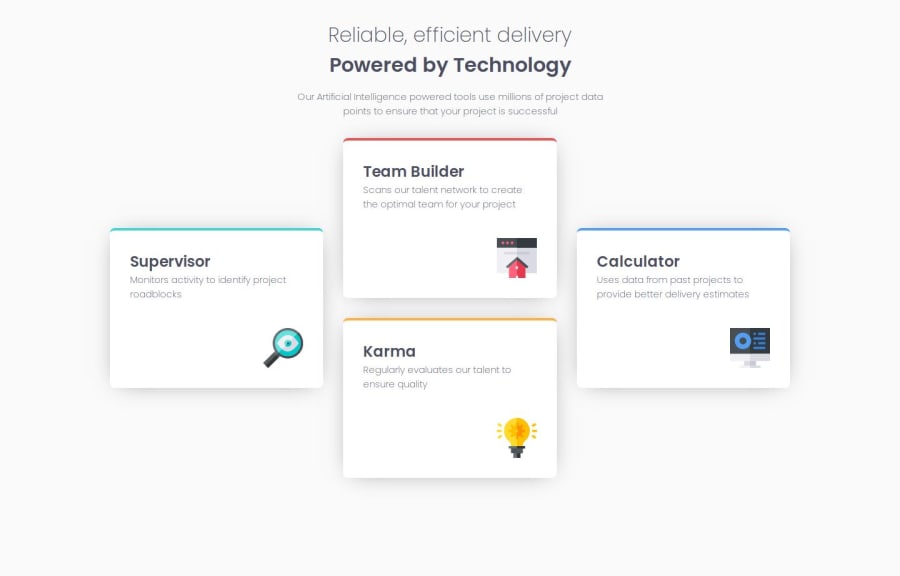
Design comparison
SolutionDesign
Solution retrospective
What are you most proud of, and what would you do differently next time?
Accuratly recreated the design using CSS grid.
Community feedback
- @LiamHiltonPosted about 2 months ago
This seems like a great way to input @media screen for specific classes! great work!
@media screen and (max-width:64rem) { .grid-container { grid-template-columns: 1fr 1fr; grid-template-rows: repeat(2, 18rem); max-width:50rem; } }
@media screen and (min-width: 64rem) { .grid-container { grid-template-columns: 1fr 1fr 1fr; grid-template-rows: repeat(4, 9rem); max-width: 70rem; }
.card-2 {
    grid-column-start: 2;
    grid-row-start: 1;
    grid-row-end: 3;
}

.card-1 {
    grid-column-start: 1;
    grid-row-start: 2;
    grid-row-end: 4;
}

.card-4 {
    grid-column-start: 3;
    grid-row-start: 2;
    grid-row-end: 4;
}

.card-3 {
    grid-column-start: 2;
    grid-row-start: 3;
    grid-row-end: 5;
}
}
@media screen and (max-width:42rem) { .grid-container { grid-template-columns: 1fr; grid-template-rows: repeat(4, 18rem); width:90%; max-width:25rem }
0
Please log in to post a comment
Log in with GitHubJoin our Discord community
Join thousands of Frontend Mentor community members taking the challenges, sharing resources, helping each other, and chatting about all things front-end!
Join our Discord
