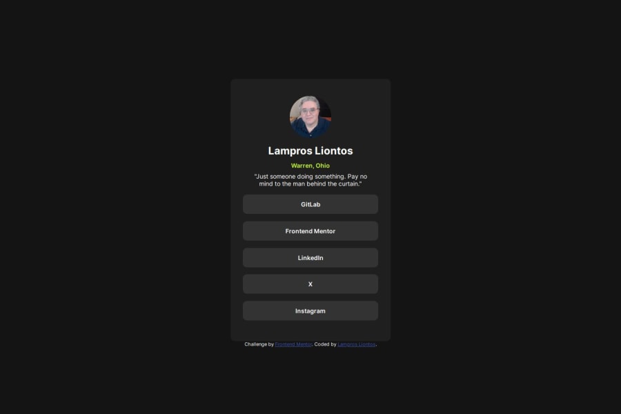
Responsive layout using CSS Flexboxes, Google Fonts


Design comparison

Solution retrospective
At this point, there's not really anything I am proud of, per se. I'm satisfied that I'm learning my way around CSS, and am able to write HTML to make the most of it.
What challenges did you encounter, and how did you overcome them?The main challenges I'm having is the fact that the attribution section is throwing off the size and positioning of the main window, since it pushes the main window up, throwing off the alignment between the page and the design screenshot. I had to add margins and padding for the top and bottom of the main area to bring it close to the original size.
Also, lining up the sides is a tricky thing, since I'm attempting to use em values instead of straight pixels. In this case, there's really no solution per se, just constant adjustment until the sides are close enough to make the difference subtle.
I'm not sure how to line up the box sizes exactly without using non-responsive elements such as pixels, as well as adding margin and padding to everything in different amounts; this seems like a poor idea at best, and a nightmare to troubleshoot later.
Community feedback
- P@danielmrz-devPosted 11 months ago
Hello there!
Congrats on completing the challenge! ✅
Your solution looks great!
📌 It's recommended to use semantic HTML elements like
<ul>and<li>for creating lists. This ensures that your code is more accessible, maintainable, and semantically meaningful.Here's and example on how you can refactor your code:
After Refactoring
<ul class="list-container">
    <li><a href="#">Github</a></li>
    <li><a href="#">Frontend Mentor</a></li>
    <li><a href="#">LinkedIn</a></li>
    ...
</ul>
By using
<ul>and<li>, you convey the structure of your content more clearly, making it easier for screen readers and search engines to understand. Additionally, it aligns with best practices for HTML semantics.I hope you find this helpful!
Keep up the excellent work!
0@reteovPosted 11 months ago@danielmrz-dev Okay, done. This was a lot trickier than I expected... First, I had to figure out how to remove the bullet points and indentation, and then there is the whole "hover/focus" thing, which was a bear to figure out until I learned about the
:focus-withineffect, which got the job done. While I was at it, I also changed my name to anh1tag to resolve that message in the accessibility report.0

Please log in to post a comment
Log in with GitHubJoin our Discord community
Join thousands of Frontend Mentor community members taking the challenges, sharing resources, helping each other, and chatting about all things front-end!
Join our Discord